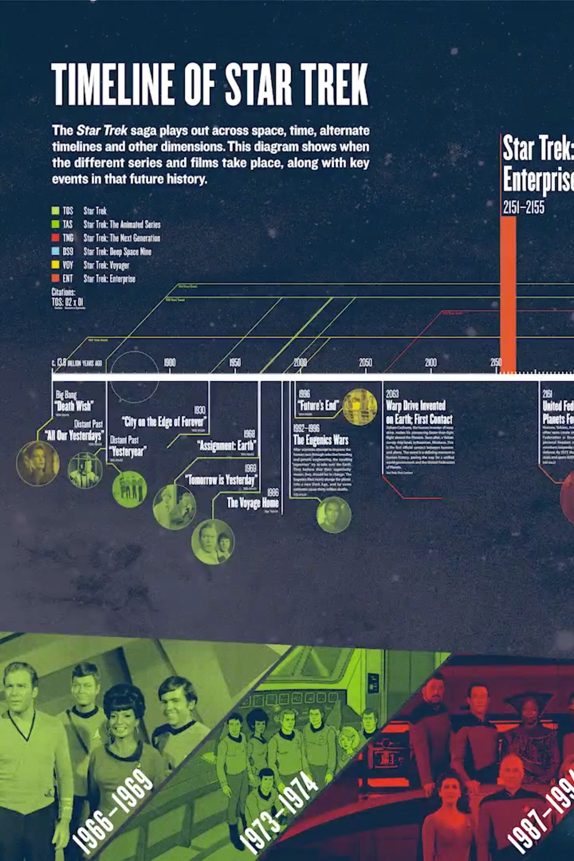
Analytics according to Captain Kirk

This is fun one from Matt Bailey, founder of SiteLogic.com.
You can read his full description here, but the point is the use of images in the chart so you can visualize the relationship between separate pieces of information. Phasers represent fights in each episode, Kirk's photo represents affairs during the episode with Captain Kirk and the colored shirts show fatalities of an actor in that colored shirt in that particular episode. Proving once and for all that being a red-shirted ensign is a hazardous job on the Enterprise.