


"The Graph" - The Future of Solar Power

Known as "The Graph" in scientific circles, this chart projects the future of solar power. It was highlighted in a Fast Company article in December 2008.
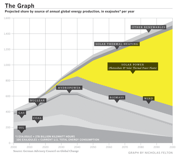
The Graph was created by a scientific organization that counsels the German government, but it has since become a prized piece of propaganda, embedded in glossy brochures and PowerPoint presentations by solar companies from California to gray-skied Saxony. At the left-hand, present-tense end of the scale, solar power is a microscopic pencil line of gold against the thick, dark bands of oil and natural gas and coal, an accurate representation of the 0.04% of the world's electricity produced by solar power as of 2006. The band grows slowly thicker for 20 years or so, and then around 2040 a dramatic inversion occurs. The mountain-peak lines indicating the various fossil fuels all fall steeply away, leaving a widening maw of golden light as solar power expands to fill the space. By 2060, solar power is the largest single band, and by 2100 it is by far the majority share.


