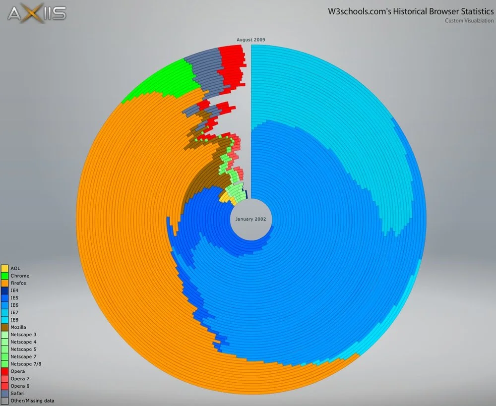
Circular Browser Statistics using Axiis

Michael VanDaniker posted this Historical Browser Statistics visual as part of the launch of Axiis, including the detail about what it took to develop this visual. At its root, this is a timeline that starts at the center (January 2002) and works outward to the outer ring that represents the most recent time slice (August 2009). Each ring is a stacked bar showing the portion of browser usage.
Each of the concentric rings are essentially pie charts showing the percentage of visitors using each browser for a particular time slice, starting with January 2002 in the center and working out to August 2009. The numbers on W3schools.com don’t quite add up to 100% because they don’t report on browsers that make up less than 0.5% of their visitors. This results in a gap at the end of each ring.
I don’t know much about Axiis (yet…), but its a new, open source framework for data visualizations.
Thanks to Les (@lesjames on Twitter) for the link!
![How Will You Manage? [video]](https://images.squarespace-cdn.com/content/v1/5bfc8dbab40b9d7dd9054f41/1554439958563-QNQKY2J78NIZHIU4817T/Screen+Shot+2019-04-04+at+10.52.05+PM.png)