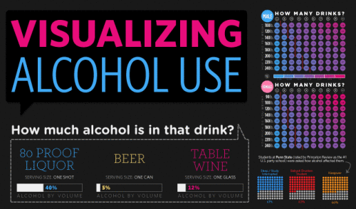
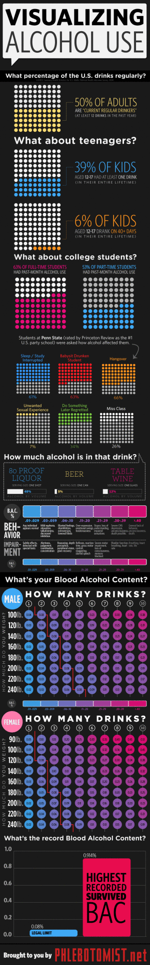
From phlebotomist.net (a website all about blood!), the highly-colorful Visualizing Alcohol Use infographic explores the effect of alcohol
How much alcohol can your bloodstream handle? Take a look at the graphic to check out everything from blood alcohol averages to the highest blood alcohol content ever survived (you won’t want to try this at home).
There’s no designer credited, but if this wasn’t designed by EJ Fox (@pseudoplacebo) then it was heavily influenced by his work.
Thanks to Cate for the link!