


The Definitive Daft Punk...Visualized!
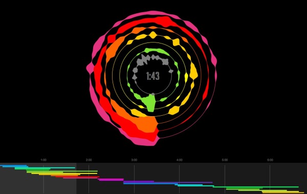
Cameron Adams, aka “The Man in Blue”, created a live visualization of the audio mashup he created between 23 different songs from Daft Punk. The Definitive Daft Punk Visualized combines a circular waveform of each of the songs concurrently being played with an audio map timeline at the bottom showing each song color-coded.
In order to explain the layering and interplay that goes into something like a Girl Talk album or The 139 Mix Tape I decided to take my own mashup of Daft Punk’s discography – Definitive Daft Punk – and reveal its entire structure: the cutting, layering, levels and equalisation of 23 different songs. By dividing up the sound data for each song and computing its appearance in realtime, the resulting visualisation gives you an understanding of the unique anatomy of this particular mashup.
The entire piece is composed from the latest HTML5 and CSS3 technology (canvas, audio, transforms & transitions) so you’ll need a newer browser to view it in. I recommend Chrome because it pulls off the best performance with my mangled code. All of the waveform and spectrum visualisation is performed in realtime, so your browser is rendering a music video on the fly!
Hopefully it gives you a new insight into the artform of the mashup, otherwise you can just stare at the pretty shapes.
Found on Twitter via @kmcostello


