


Tomorrow's World

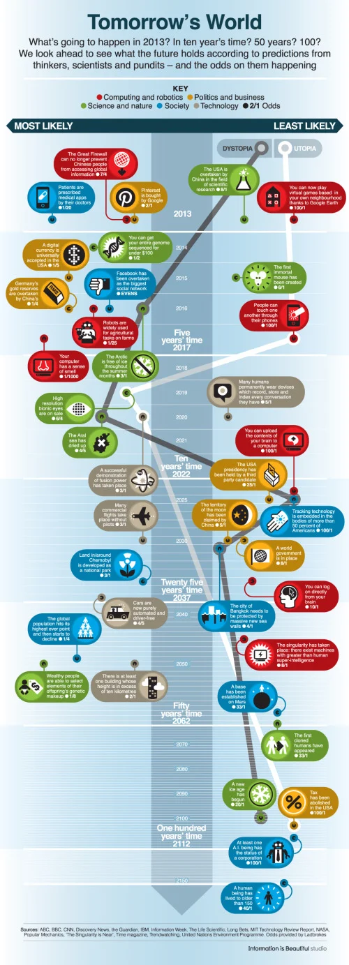
Tomorrow’s World infographic from the BBC maps out many of the future predictions from experts onto a timeline of the next 100 years, and lays out odds on how likely each prediction may come true.
As we begin a new year, BBC Future has compiled 40 intriguing predictions made by scientists, politicians, journalists, bloggers and other assorted pundits in recent years about the shape of the world from 2013 to 2150.
They range from the serious to the fanciful, from the exciting to the petrifying.
And to get a gauge on how likely they are to happen, we asked the special bets department at British betting firm Ladbrokes to give us their odds on each prediction coming true.
The predictions are color-coded by category, placed along the timeline and finally shown in the horizontal direction based on the odds. This is a really good design, and I like the custom icons for each prediction.
Found on CNET thanks to a Tweet from Dave (@Drodgerson)!


