Peter Sena - What Makes an Infographic Cool?
Guest Post by Peter Sena
Infographics, another problem solved through design
As a designer, everything I see is a form of an infographic. Whether the packaging on the shelves of a grocery store, to the interface in my car, down to the websites I visit each day, being able to visualize and experience information easily is a critical part of design. Infographics were born for that very same purpose, to take the complex and simplify it or capture it in a way where the viewer can easily draw conclusions from the information. If you’ve been anywhere on the web you’ve likely seen a slew of infographics plastered all over Pinterest or your favorite websites and blogs.
Cool Infographics does a fantastic job at capturing some of the best and most interesting infographics so rather than talk about a problem that is already solved, I figure I’ll walk you through a few of my recent favorite examples of data visualizations that help tell a story, evoke an emotion or speed up ones access to research.
Infographics that make us remember
Storytelling is one of the oldest forms of sharing information and the thing that legends are made of. Making one remember their past is a sure-fire way to truly capture the attention of your viewer. Foursquare’s recent partnership with Samsung to launch their Time Machine is a great example of how data can be visualized in a way to make us remember not just where we are, but we’re we’ve been. Tapping into viewers’ memories is a key way to trigger emotion to your viewer. Their time machine let’s you login with your foursquare account and you can take a trip down memory lane to see all the places you’ve checked into and explore that data in a very intuitive, interactive fashion. (https://foursquare.com/timemachine)

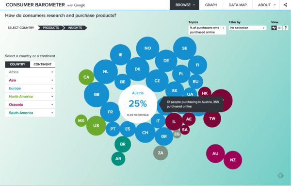
Infographics as a research tool
With so much data at our fingertips one Google search away, being able to drill down to find the information we’re are after is a critical need. Google’s Consumer Barometer and Real-Time Insight Finder let you browse their databases in a very visual way and look into how consumers are using the Internet, searching for and buying products, and what ways they are connecting to the internet.
Google’s Real-Time Insight Finder:www.google.com/think/tools/real-time-insights.html

Google’s Consumer Barometer:www.consumerbarometer.com
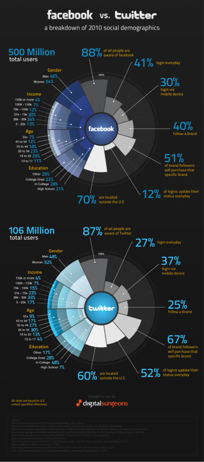
Our Facebook vs Twitter infographic, received almost 13 million page views since we posted it, with reshares, likes, tweets and pins all over the internet but aside from asking us to update it with new data, the biggest request from users was the ability to see it interactive and give the ability to segment and view the data in different ways. I feel Google is doing a fantastic job at making information fun and intuitive to access and doing it with the perfect blend of form and function.
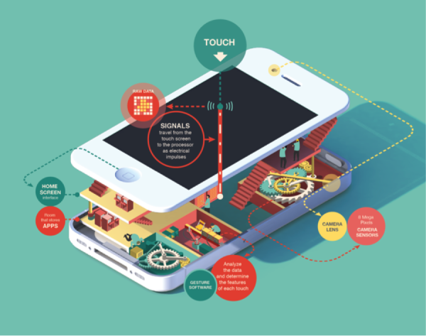
Infographics that show you how it works.
I absolutely love these infographics because they take complex devices and break them down in a beautiful designed, easy to understand way in the form of a cross-section view while incorporating aspects of the popular flat-design visual style.
Why they work so well?
We’re visual beings with almost 50% of our brains being used for processing visuals. People’s attention spans are decreasing by the day due to the sheer amount of information that they are presented with. Give someone the ability to quickly scan something and you are much more likely not to lose their attention. The good folks at NEOMAM.com put together this great infographic on thirteen reasons why our brains crave infographics, which takes a much deeper dive into the science behind them.
What infographics and data visualizations are inspiring to you these days? Shoot me a tweet and lemme know.

Pete Sena is the founder of Digital Surgeons, a digital-first creative agency that specializes in combining design and technology to connect brands and consumers.
LINKS:
Twitter: @petesena
LinkedIn: petersena