


Information Destruction Through History
Information Destruction Through History from Global Data Vault explores and quantifies the worst data disasters in history.
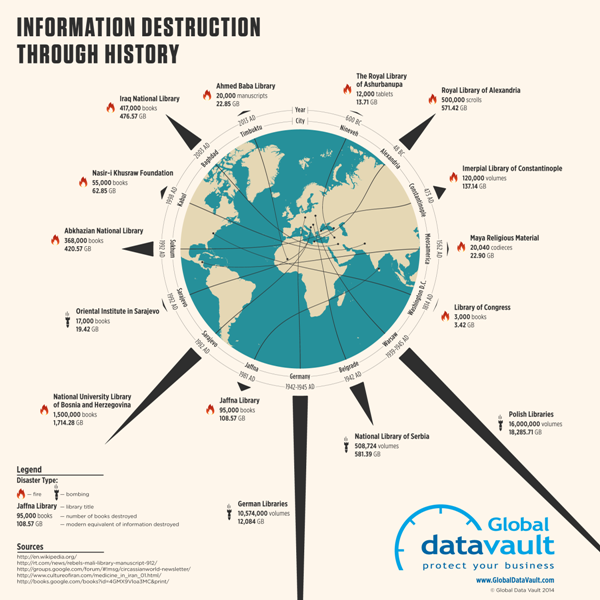
Information the most valuable commodity in the world. All human progress depends on the accumulation and preservation of information. When information is lost, human progress suffers. This infographic displays some of the most significant loses of information human civilization has suffered.
The circular timeline shows the data disaster events in chronological order, while also connecting to their geographic locations. The triangles are proportionally sized so readers can visually compare the modern data equivalents between the events. This really helps put the disasters into perspective for the audience.
A great infographic design that tells one story really well, but there are a few things I would recommend to improve the design:
I wouldn’t have any of the triangles run off the page, because the audience will lose perspective on how disastrous those specific events were. Show the full impact of those events to the readers.
Add the URL directly to the infographic landing page so readers can find the original full-size version when people don’t link back correctly
I wouldn’t list Wikipedia as a data source if possible. Track the Wikipedia references back to the original data source to include in the list.
Thanks to Joe for sending in the link!


