Women and Fashion In the Digital Age
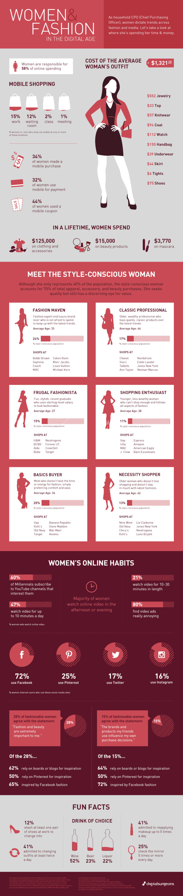
The Women and Fashion In the Digital Age infographic from Digital Surgeons breaks down how much a women spends on each item. This infographic also creates categories for each woman based on her style sense.
A household CPO (Chief Purchasing Officer), women dictate trends across fashion and media. Let’s take a look at where she’s spending her time & money.
Good data and simple graphics that add context to the numbers. Love the icons and silhouettes and the minimal color palette. Simple character illustrations like these keep the focus on the data, and not the illustrations. However, there are two major infographic design lessons that can be learned form this design.
First, shading portions of odd shapes is always tricky, so in this design the shaded shopping bags and bottles don’t actually match the data. The reader’s eye sees the area of the colored shapes, and this is usually straightforward when working with basic shapes like rectangles and circles. However, even with simple circles, the designer can’t just calculate the height of shaded regions like a bar chart. That only works with rectangles, because the area is directly proportional to the height. The math to calculate the correct area of a circle segment requires a little more math from geometry. There’s no clear formula to calculate the area of a wine bottle or a shopping bag, so the designer had to take their best guess.
Second, big fonts are not data visualizations! I hate to see values on an infographic that aren’t visualized. They provide no context for the readers, and are perceived as less important than the numbers that are visualized. The job of a good infographic is to make information easier to understand, not just to share information. Even simple bars under each component of a woman’s outfit in the first section would have helps make the data meaningful to the audience.
You won’t find a link to this infographic on the Digital Surgeons home page, so the infographic image file itself should include the URL back to the landing page in text. That way readers that see this infographic on other sites can make their way back to the original, full-size version. Many sites that post infographics, don’t link back to the original like I do. Don’t make it hard for your audience to find your infographic!
Thanks to Peter for sending in the link!