The Key to Infographic Marketing: The Psychology of the Picture Superiority Effect
In Ancient times, Cicero considered memory training to not just be a method, but a form of art. He felt strongly that training your memory was one of the most valuable things you could do to improve your capabilities as a speaker, and a citizen. Even in ancient times, Cicero knew that remembering images was superior to remembering text alone.
People remember pictures better than words, especially over longer periods of time. This phenomenon as we know it today, is called the Picture Superiority Effect*. It refers to the notion that concepts that are learned by viewing pictures are more easily and frequently recalled than are concepts that are learned by reading their written word form counterparts.
What had been known to the Ancients throughout the centuries, has been quantified scientifically in our modern times. In my book, I included this quote from John Medina’s Brain Rules, to help explain the value of the Picture Superiority Effect. However, to make it visual I created this simple data visualization to help readers remember the power of visual information.
“Based on research into the Picture Superiority Effect, when we read text alone, we are likely to remember only 10 percent of the information 3 days later. If that information is presented to us as text combined with a relevant image, we are likely to remember 65 percent of the information 3 days later.” - John Medina, Brain Rules, 2008

via: coolinfographics.com/book
Advertisers have known this for years. Whether it’s been a simple application like the Yellow Pages (ads with pictures got more business)or giant billboards in New York’s Times Square. To see a real world example of how the Picture Superiority Effect works, check out this excellent coverage area map ad campaign from Verizon:
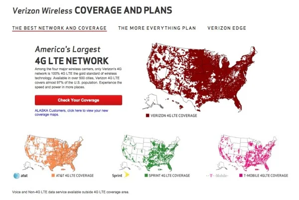
These maps show Verizon’s 4G LTE network coverage area, compared to the coverage area of their competitors. If you were only to get the text version, imagine how much of this paragraph explaining their coverage area you would remember 3 days after reading it:
“Among the four major wireless carriers, only Verizon’s 4G network is 100% 4G LTE the gold standard of wireless technology. Available in over 500 cities, Verizon 4G LTE covers almost 97% of the U.S. population. Experience the speed and power in more places.”
Now, take a look at the maps again. How much easier it is to see how the four major wireless carriers stack up against each other? It’s obvious Verizon covers the most area. Verizon takes it a step further, and has a link to a PDF highlighting their coverage in Alaska and an interactive map to view different parts of the country. All complete with map visualizations, of course.
However, there is another very important aspect of the Picture Superiority Effect that must be understood: It’s not just any image. It needs to be an image relevant to the content, which reinforces the message from your data. This works across all mediums of advertising, and of course, infographics.
In infographic design, the Picture Superiority Effect is extended to include charts, graphs, and data visualizations. Infographic designers use data visualizations and illustrations as the visual component of a design to trigger the Picture Superiority Effect, which can have incredible success getting the audience to remember the information presented.
Here is an great example from Dan Roam, author of the book, The Back of the Napkin, Solving Problems and Selling Ideas With Pictures, of how using images and text can help a designer understand which type of visualization is appropriate to use when communicating different types of information. Easy to understand, easy to remember.

via: DanRoam.com
Infographics work so well because using text and images together helps people to retain the information. Remember, if it’s just words, people will only remember 10% of the information they read. But, if you combine the text with a relevant image, they are likely remember 65% of the information! While others may choose to work harder by crafting a perfectly written article or advertisement, it would be a smarter choice to use text and relevant images together.
Remember to “Make It Visual” if you want your audience to remember the information about your company’s products or services. You don’t have to be a professional designer either. You can make your content visual using a wide range of tools like the Adobe Creative Cloud suite, Microsoft PowerPoint, OmniGraffle, or online design tools like Visme.co or Tableau Public.
Sources:
*Nelson, D.L., Reed, U.S., & Walling, J.R. (1976). Pictorial superiority effect. Journal of Experimental Psychology: Human Learning & Memory, 2, 523-528.
Update
on 2015-01-21 16:26 by Randy
Also picked up by The Huffington Post, and published in their Business vertical: http://www.huffingtonpost.com/randy-krum/the-key-to-infographic-ma_b_6510744.html