How Long Will It Last?
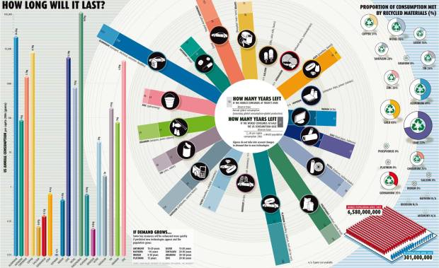
Good infographic from the New Scientist showing how many years we have left of our key natural resources. Essentially these are basic bar and pie charts, but dressed up to make the overall graphic more compelling. The message is still clear though, and the author gets his point across very strongly.
This comes from a 2007 article in the New Scientist called "Earth's Natural Wealth: an Audit" that include two more infographics as well. The first is a map of where in the world are these natural resources are.

The next is a bubble graphic showing the scale of how much of each resource an average American will consume during their lifetime.

The Source listed on the first infographic: Armin Reller, University of Augsburg, Tom Graedel, Yale University
Found on FlowingData.com and numerous Twitter references. Thanks Nathan.