Map of the Internet 2021
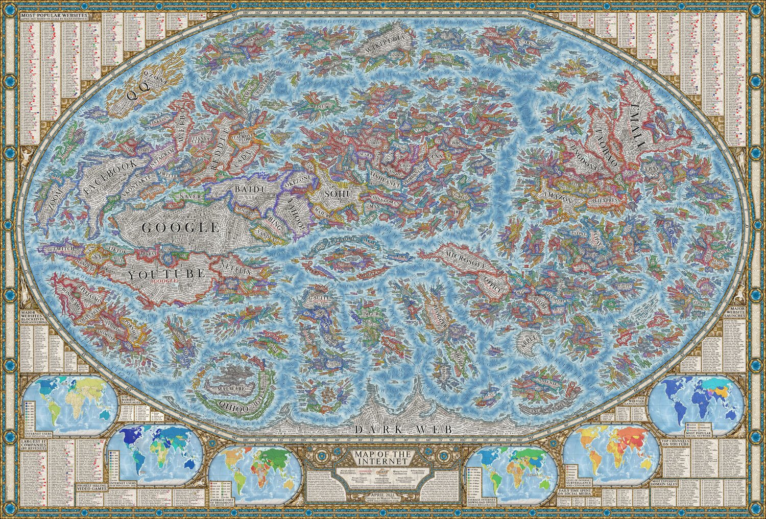
Map of the Internet 2021 visualizes the most popular websites in the style of an old historical map, created by Martin Vargic at Halcyon Maps. The sizes of the Internet “countries” on the map are based on the their relative web traffic, and clustered by type of website.
After a better part of a year of work, I am excited to show you a brand new Map of the Internet, up to date for the year 2021.
Inspired by design of historical maps, this project aims to concisely, but still comprehensively visualize the current state of the World Wide Web, and document the largest and most popular websites over the period of 2020-2021, along with their countless aspects and features.
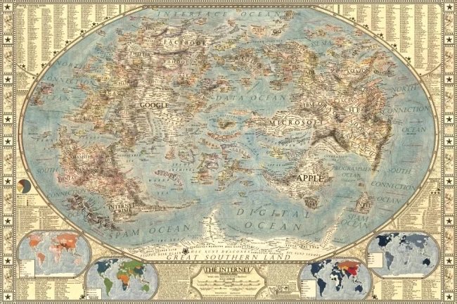
This work was originally inspired by the “Map of Online Communities“ by Randall Munroe, and further by my own maps of the internet 1.0, 2.0 and 3.0 previously published in 2014-2015.
The Internet has come a LONG WAY since Randall Munroe’s original design I posted about in 2008.
From Martin Vargic:
Compared to any previous iteration of the Map of the Internet, this new version is many times more detailed and informative. It includes several thousand of some of the most popular websites, represented as distinct "countries", which are grouped together with others of similar type or category, forming dozens of distinct clusters, regions and continents that stretch throughout the map, such as "news sites", "search engines", "social networks", "e-commerce", "adult entertainment", "file sharing", "software companies" and so much more. In the center of it all can be found ISPs and web browsers, which form the core and backbone of the internet as we know it, while the far south is the domain of the mysterious "dark web".
Color schemes of websites are based on the dominant colors of their user interface or logo. To add further detail and provide deeper insight, many features and services provided by these websites, their sections and content categories, as well as distinct content creators, are labeled as cities and towns (which number at well over 10 thousand). Website founders and CEOs are represented as capital cities, while hundreds of the most popular users of social networks and celebrities can be found in the realms of Youtube, Facebook, or Twitter. Mountains, hills, seas and valleys represent a wide variety of aspects of the internet, its culture and computer science overall, while almost a hundred of some of the most important internet and computing pioneers are also featured on the map in the names of underwater ridges.


