


Visualizing Everyone that has Ever Lived
How do you visualize every human that has ever lived in the last 2 million years? Max Roser with Our World in Data had the idea to turn us all into grains of sand within an hourglass, and to equate the passing of people to the passing of time. The Humanity Today and Humanity’s Past infographic highlights a few key points in history and gives us a perspective of just how population growth has exploded over the last 2000 years.
Our past
Before we look ahead, let’s look back. How many came before us? How many humans have ever lived?
It is not possible to answer this question precisely, but demographers Toshiko Kaneda and Carl Haub have tackled the question using the historical knowledge that we do have.
There isn’t a particular moment in which humanity came into existence, as the transition from species to species is gradual. But if one wants to count all humans one has to make a decision about when the first humans lived. The two demographers used 200,000 years before today as this cutoff.1
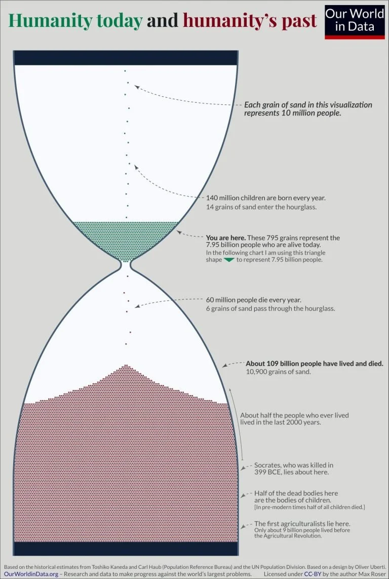
The demographers estimate that in these 200,000 years about 109 billion people have lived and died.2
It is these 109 billion people we have to thank for the civilization that we live in. The languages we speak, the food we cook, the music we enjoy, the tools we use – what we know we learned from them. The houses we live in, the infrastructure we rely on, the grand achievements of architecture – much of what we see around us was built by them.
Our present
In 2022 7.95 billion of us are alive. Taken together with those who have died, about 117 billion humans have been born since the dawn of modern humankind.
This means that those of us who are alive now represent about 6.8% of all people who ever lived.
These numbers are hard to grasp. I tried to bring it into a visualization to put them into perspective.3
It’s a giant hourglass. But instead of measuring the passage of time, it measures the passage of people.
Each grain of sand here represents 10 million people: each year 140 million babies are born. So we add 14 grains of sand to the hourglass. Every year, 60 million people die; this means 6 grains pass through the hourglass and are added to the large number of people who have died.4
As noted on the graphic, this is an updated adaptation of a 2013 visualization by Oliver Uberti.
Found on Daily Infographic


