The Billion Dollar Gram
This is one of those simple, but great infographics. Once the news starts talking about "billions" of dollars, the brain goes numb and it all runs together because the numbers are too big for us to comprehend.
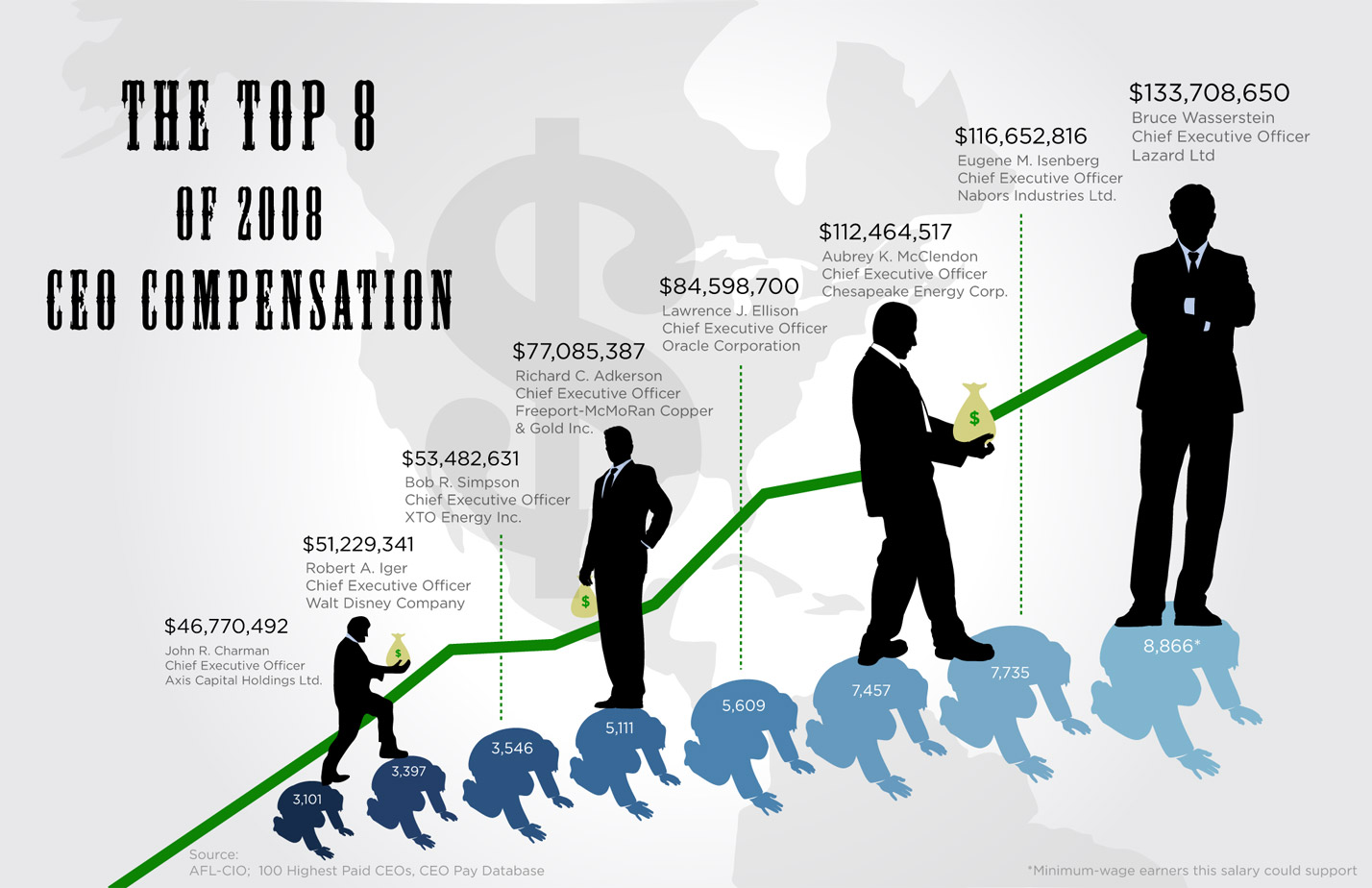
David McCandless, from Information Is Beautiful, created this tree map to show the relative size of the different billion dollar spending and budgets in the news.
Great job David, keep them coming!


