
Collection of data visualization chart choosers, reference guides, cheat sheets, websites and infographics about dataviz design best practices.
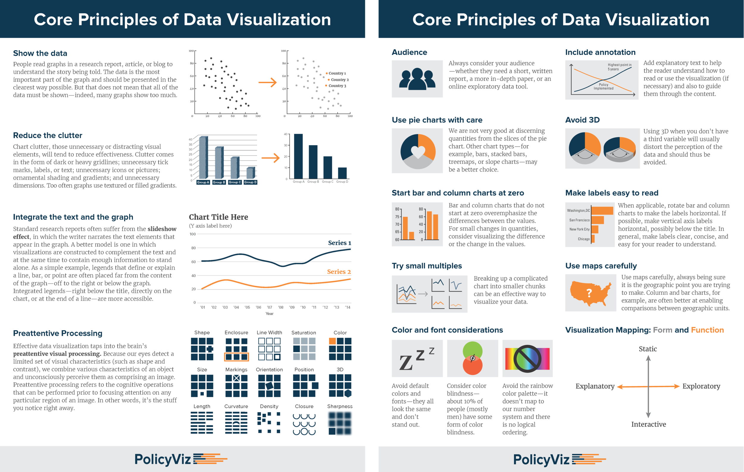
Jon Schwabish from PolicyViz has published a fantastic 2-sided cheatsheet of the Core Principles of Data Visualization. The images are available on his blog, or you can download the PDF version from PolicyViz for $1
Use the code coolinfographics for 10% OFF everything in the PolicyViz store!
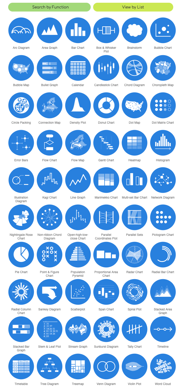
The Data Visualisation Catalogue is a free online resource developed by Severino Ribecca to create a reference library of different information visualization types. You can filter the visualization types by function to help choose the right chart type for your data, and the details for each visualization includes a full description and anatomy, links to examples of the chart in practice and links to tools to create your own.
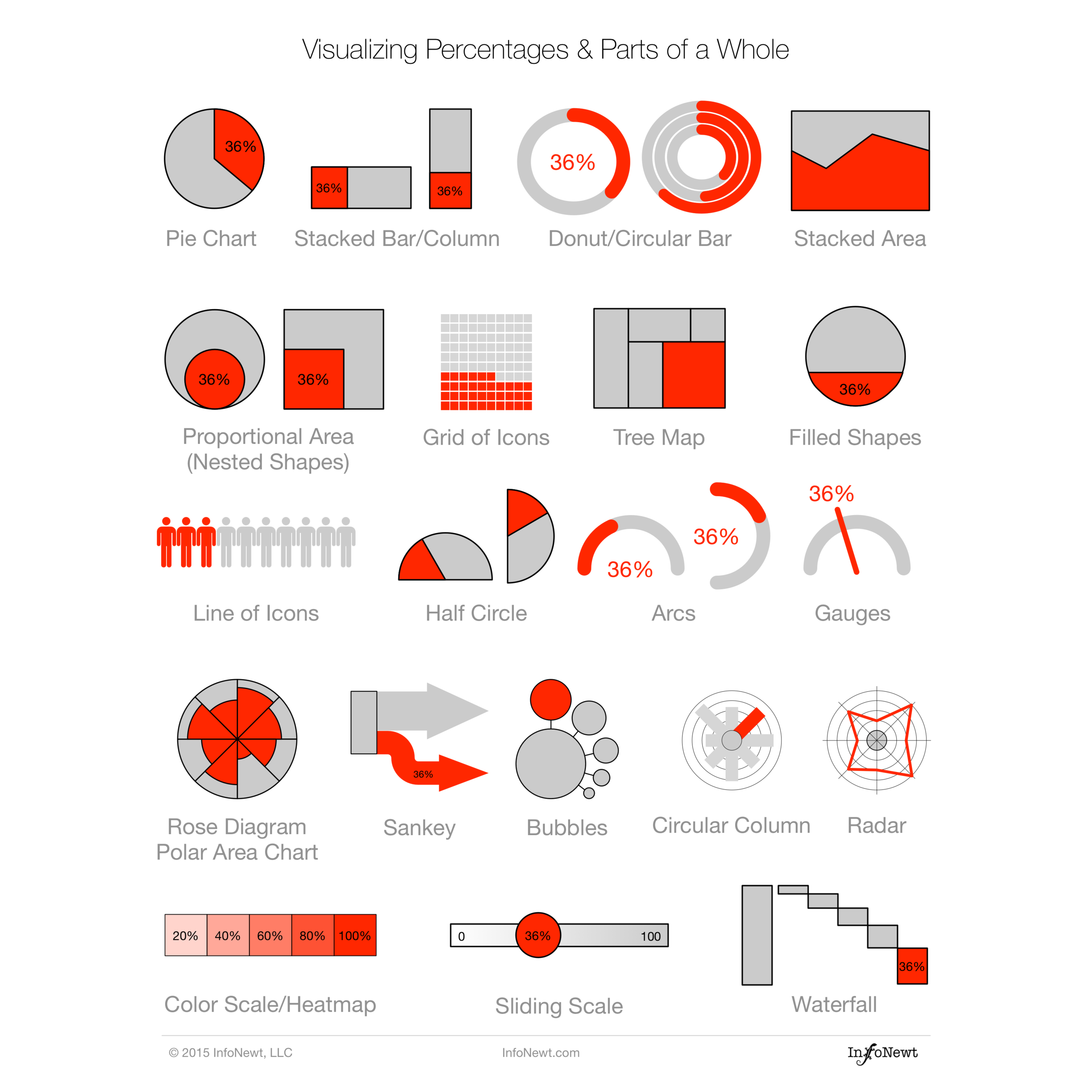
Working with percentages is very common, and one of the most challenging parts of designing data visualizations is coming up with new ways to visualize your data. One of the exercises I have student do in class is brainstorm a list of the many ways to visualize percentages, and I created this reference sheet of the Top 20 Ways to Visualize Percentages from their work. I hope it gives you some ideas for different ways to visualize percentage data, and help you break out of always using pie charts.
Available as a downloadable PDF from the InfoNewt site.
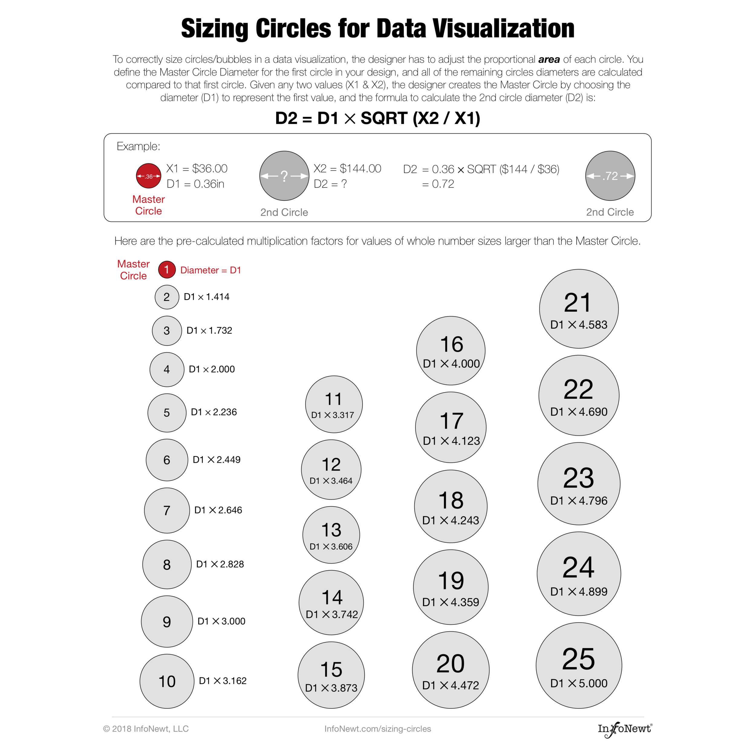
To correctly size circles (or bubbles) in a data visualization, the designer has to adjust the proportional AREA of each circle. It is a common mistake to adjust the diameter for each circle, because width and height are the common input fields in design software. Charting software, like Excel or Tableau, does this automatically in Bubble Charts, but if you want control over the layout of the circles, you'll need to design your own.
The reference sheet is available as a downloadable PDF from the InfoNewt site.

This is the original Chart Chooser that was designed and published by Dr. Andrew Abela, author of the books The Presentation, Advanced Presentations By Design and the Encyclopedia of Slide Layouts. The Chart Chooser is a flowchart guide that starts in the center, asking what type of data you have to work with, and then flows outward to identify the types of charts that are appropriate to your data.
Available on his website as a free downloadable PDF, and also available in Portuguese, Spanish, Japanese, and Chinese!
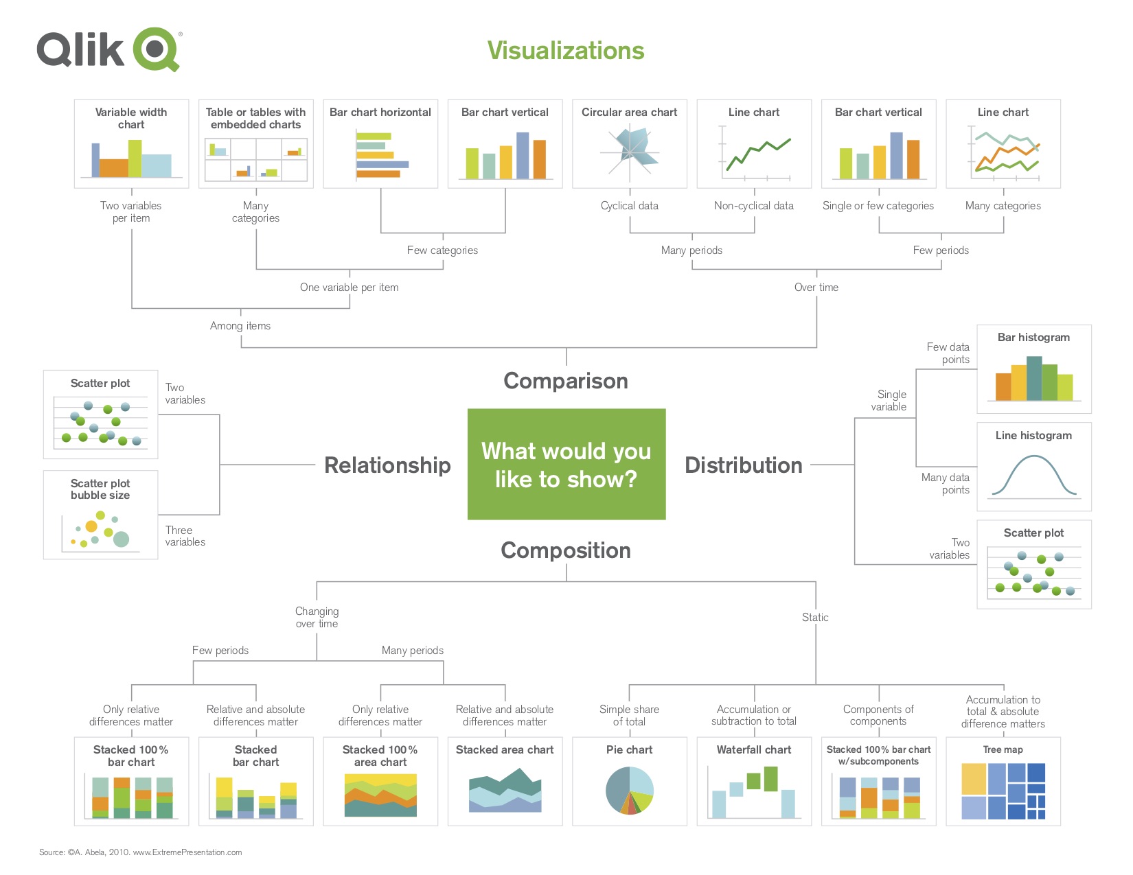
Patrik Lundblad at Qlik created a downloadable color version of the Chart Chooser PDF that also has additional pages that dissect each of the chart groups: Comparison, Composition, Distribution and Relationship.

Juice Analytics got permission from Dr. Abela to create this interactive version of The Chart Chooser that is available to everyone.

Jon Schwabish and Severino Ribecca collaborated together to create The Graphic Continuum, with more than 90 graphic types grouped into 6 categories on a laminated 8.5″x11″ sheet. It does not include every type of graphic, nor does it display every type of link between visualization, but it serves as a thought-starter. Use it to develop ideas, consider different options, or simply as a piece of art.
Use the code coolinfographics for 10% OFF everything in the PolicyViz store!
Also available as a poster print!
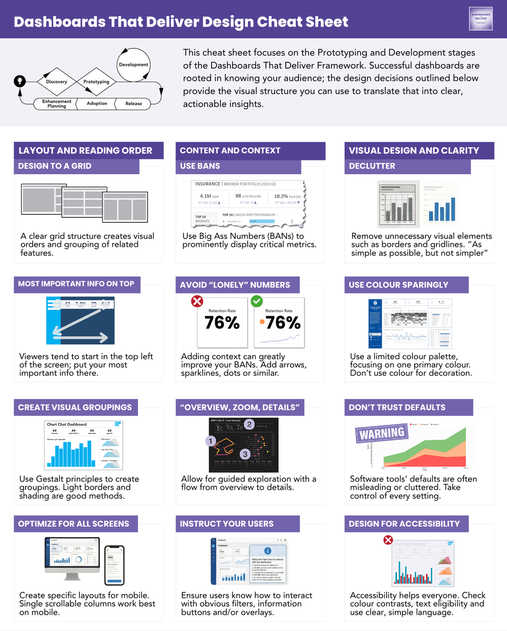
Successful dashboards are rooted in knowing your audience; the design decisions outlined in the cheat sheet provide the visual structure you can use to translate that into clear actionable insights.
You can download the PDF to print and keep as a reference.

A poster (available in English, Japanese, traditional Chinese and simplified Chinese) and web site to assist designers and journalists to select the optimal symbology for data visualisations, by the Financial Times Visual Journalism Team.
The FT Visual Vocabulary is at the core of a newsroom-wide training session aimed at improving chart literacy. This learning resource is inspired by the Graphic Continuum by Jon Schwabish and Severino Ribecca. This is not an attempt to teach everyone how to make charts, but how to recognise the opportunities to use them effectively alongside words.
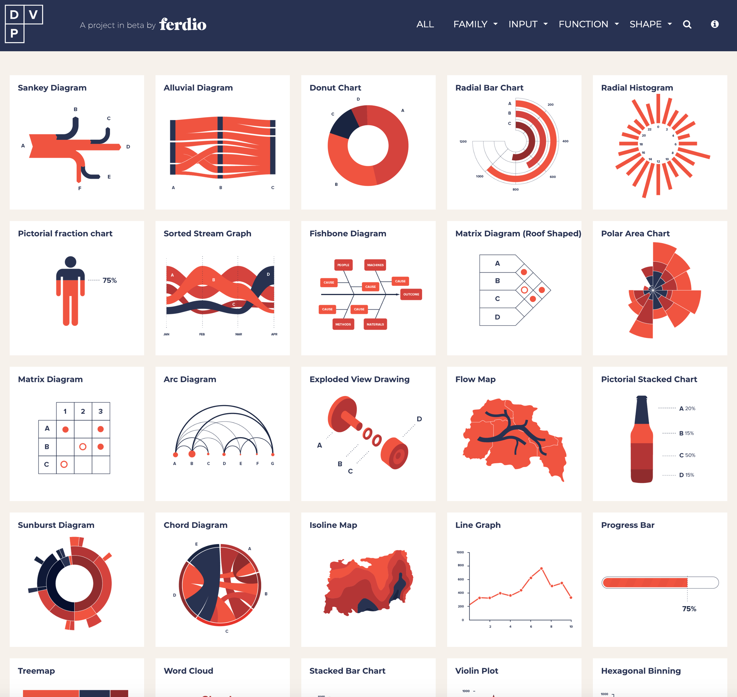
The Data Viz Project is a website trying to present all relevant data visualizations, so you can find the right visualization and get inspired how to make them. It started out as an internal tool box at ferdio, an infographic and data visualization agency in Copenhagen, and grew into a public website where you and others can use it as a tool and inspiration.
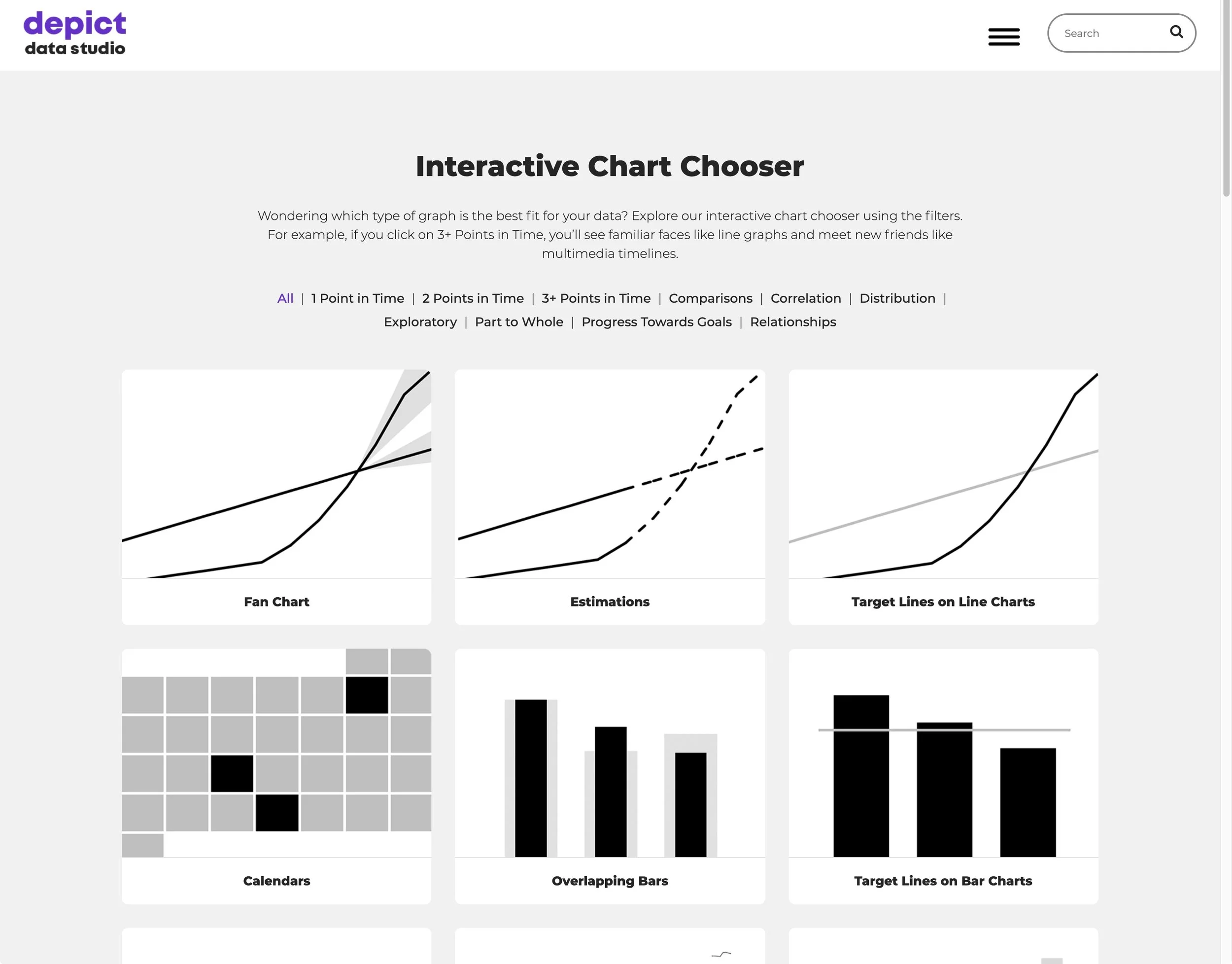
Wondering which type of graph is the best fit for your data? Explore the Interactive Chart Chooser from Ann K. Emery’s company Depict Data Studio by using the filters. For example, if you click on 3+ Points in Time, you’ll see familiar faces like line graphs and meet new friends like multimedia timelines.
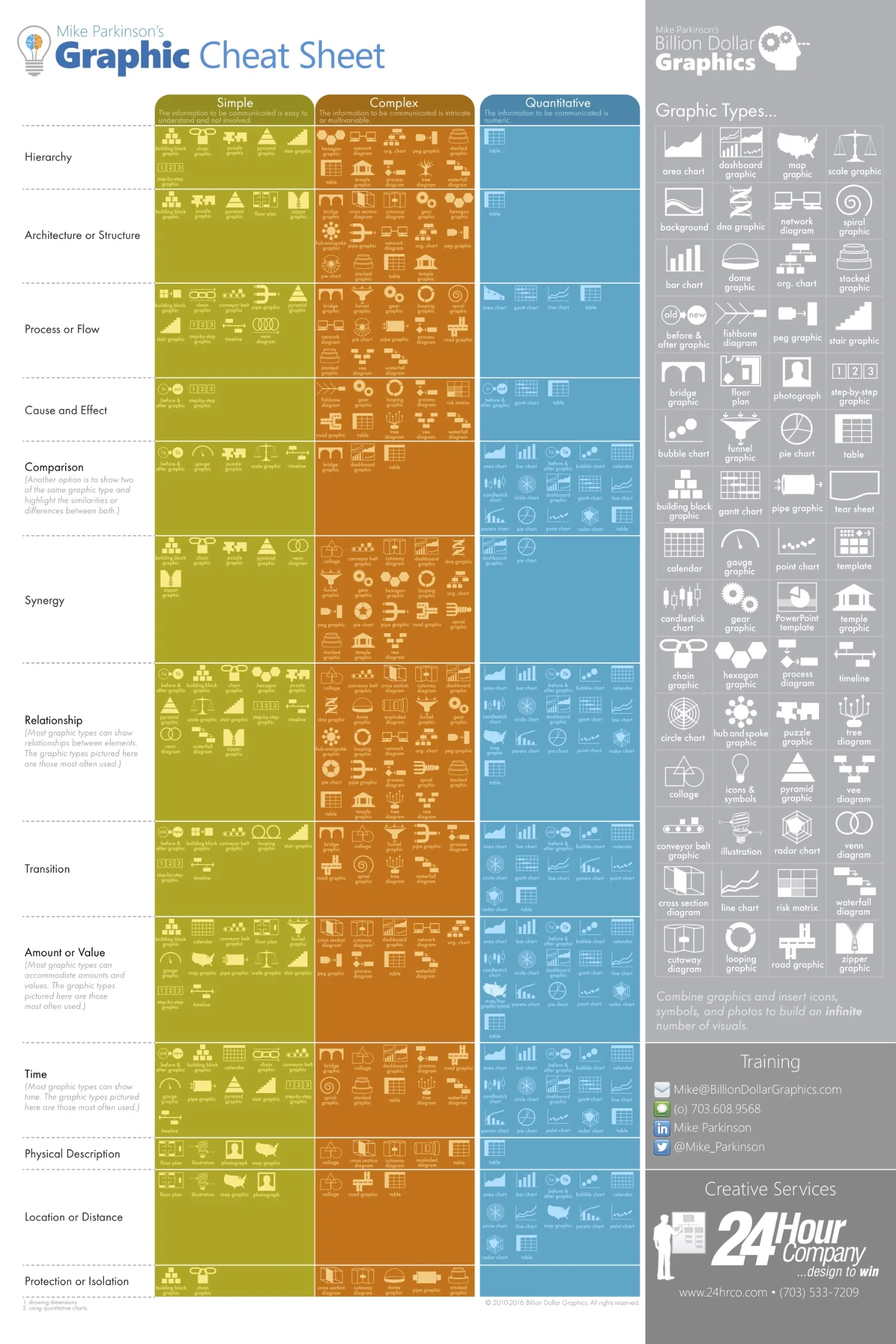
The Graphic Cheat Sheet was designed by Mike Parkinson, and is a very popular handout distributed at his conference talks. He has updated it numerous times over the years, and it’s available to download as a PDF. 60 different graphic types are grouped as Simple, Complex or Quantitative and shown when they can apply to be used to communicate 13 different types of data.
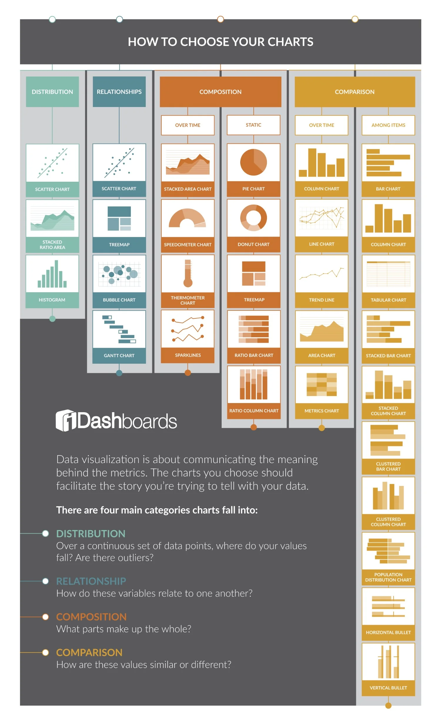
Infographic from iDashboards that groups chart types into four main categories: Distribution, Relationship, Composition and Comparison.
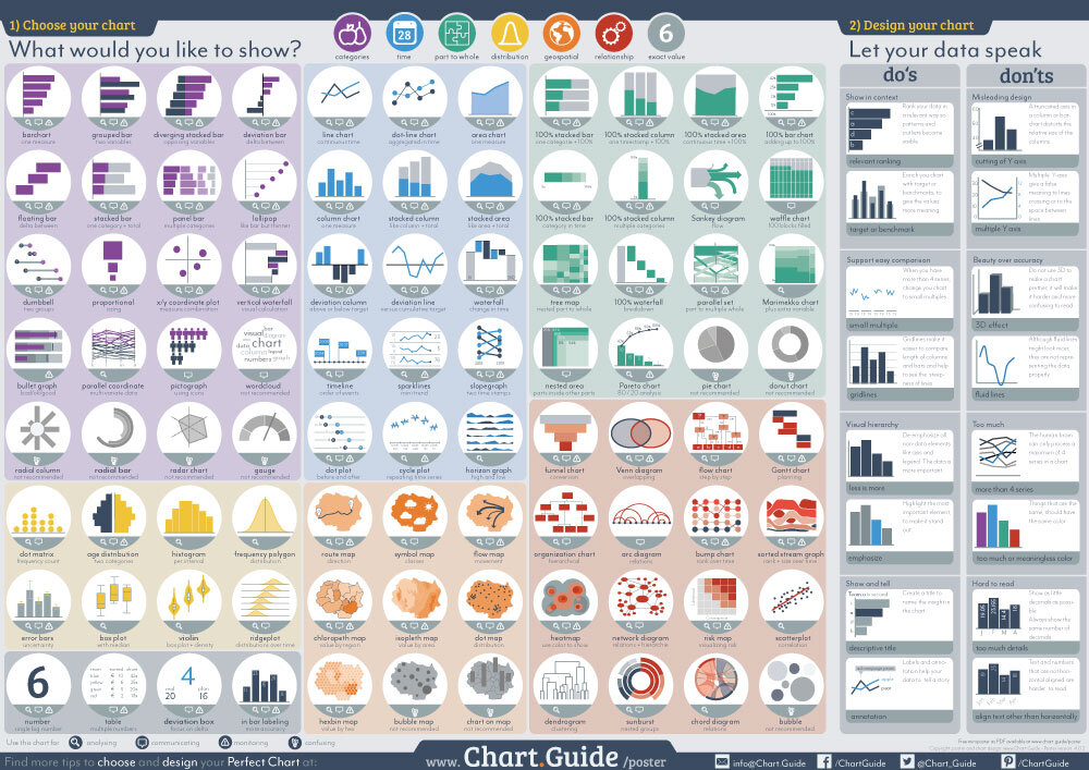
Michiel Dullaert created the Chart Guide for his data visualization classes, and has made it available to everyone through the website chart.guide as a downloadable PDF or for purchase as a printed poster.
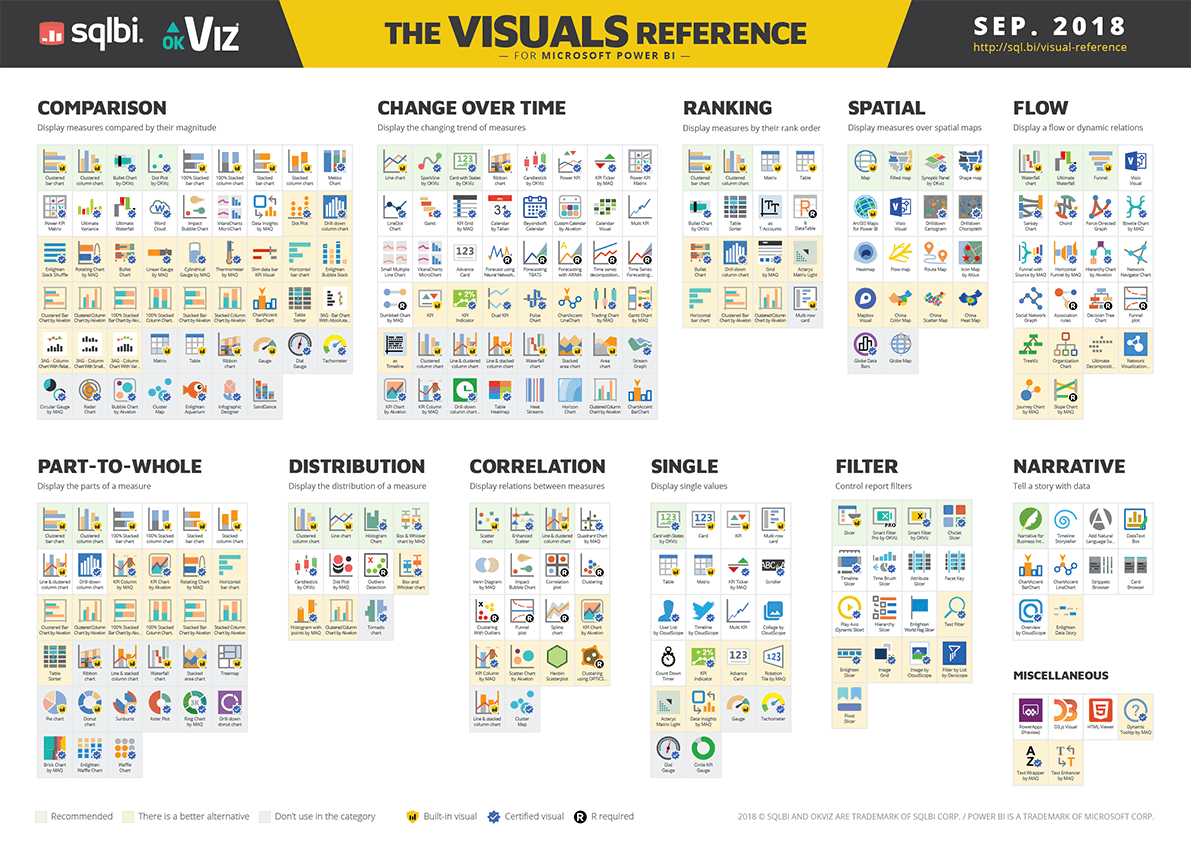
Even though it’s directed at users of Microsoft Power BI, this reference is a good classification for everyone. SQLBI analyzed all the 204 visuals available on Sep. 2018, assigned them to various categories, and printed the result in a downloadable PDF file. The legend allows you to identify built-in visuals, certified visuals, and visuals requiring an R environment. Furthermore, for some of the visuals we indicated better alternatives within the same category.
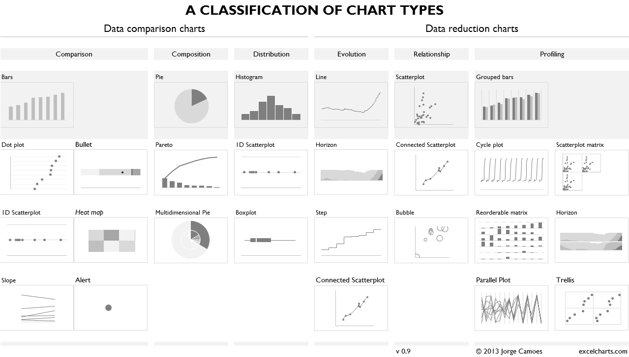
Designed by Jorge Camões, author of Data at Work and the website ExcelCharts.com. Jorge built this classification of chart types while writing his book, and it breaks down the various charts into answering six types of data questions, three of them involving data comparison and the other three data reduction.

Andy Kirk at Visualizing Data has created The Chartmaker Directory where each of the dots are links to tools and examples of the different chart types listed along the left side in each of the many different tools listed across the top. Especially useful if you are trying to figure out how to create a unique chart type in a specific tool.
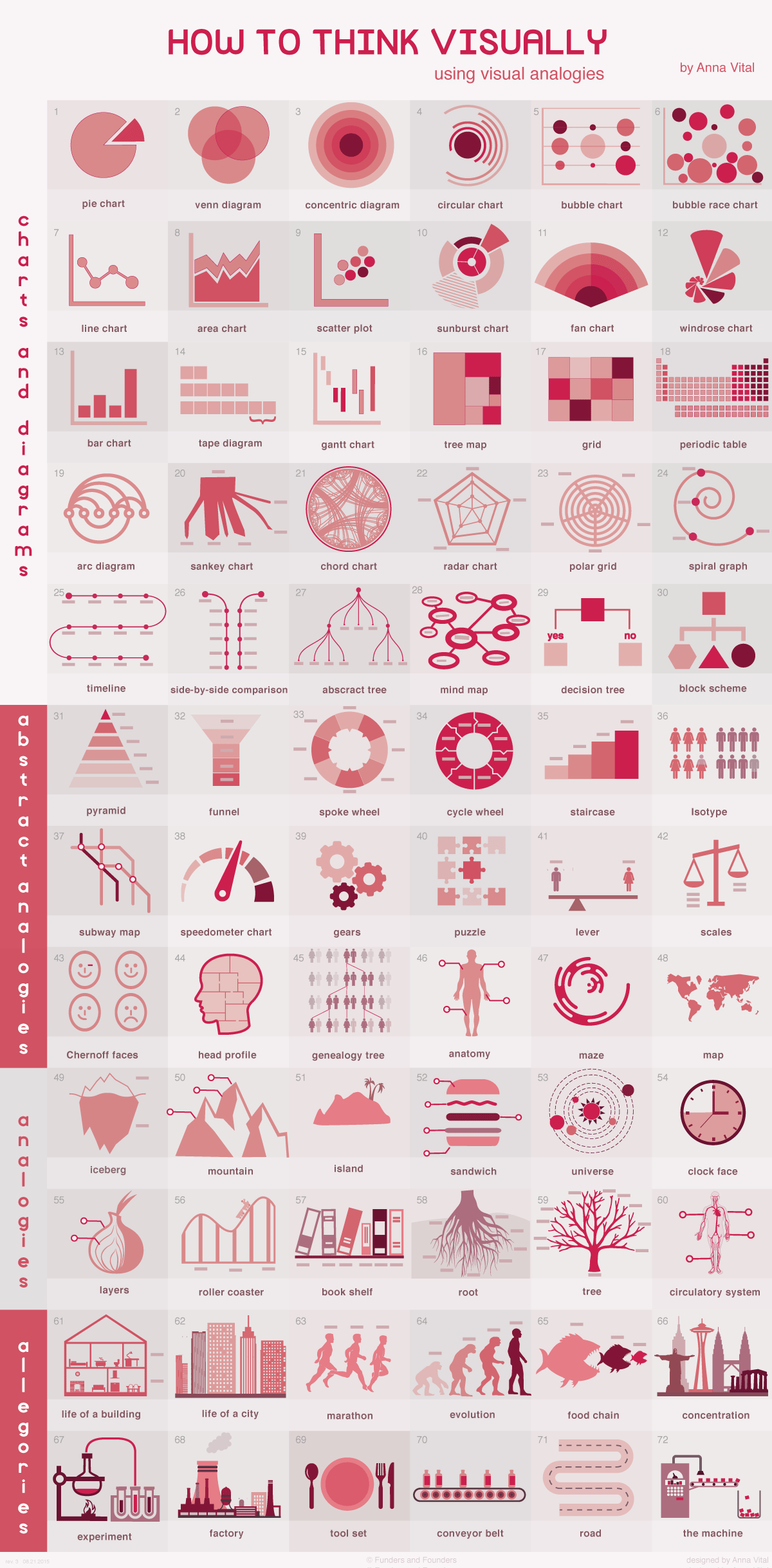
This infographic from Anna Vital at Adioma groups 72 different visualization methods into four main categories: Charts & Diagrams, Abstract Analogies, Analogies, and Allegories. This goes beyond the traditional numerical data visualization methods to include more conceptual visual styles and diagrams often used in business environments.
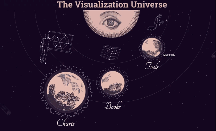
The Visualization Universe is an interactive guide to data visualization charts, books and tools, and was designed as a collaboration between Google News Lab and Adioma.
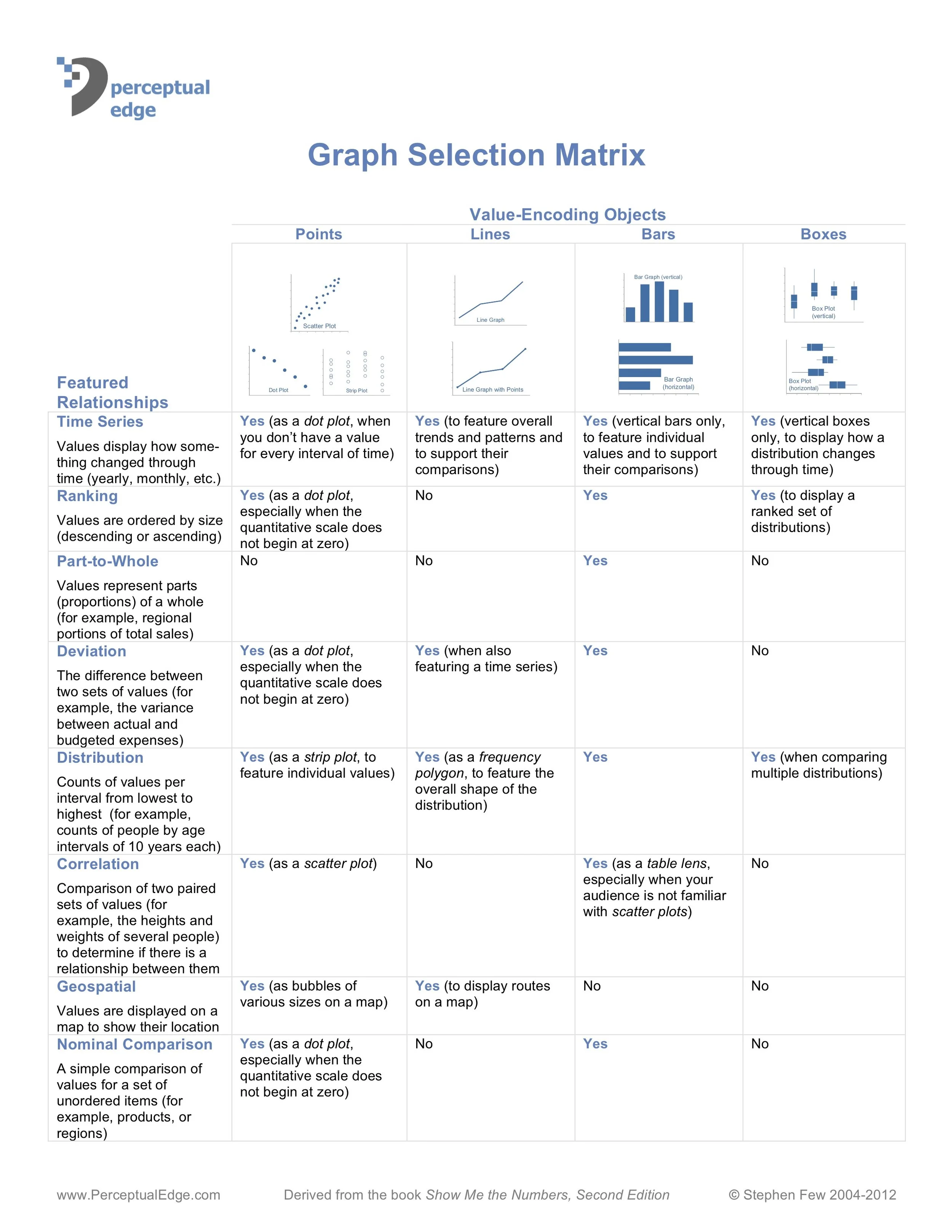
The Graph Selection Matrix comes from Stephen Few’s book, Show Me The Numbers, and is available as a stand-alone PDF download.

This is a collaboration from Stephanie Evergreen & Ann K. Emery. The Data Visualization Checklist is a compilation of 24 guidelines on how graphs should be formatted to best show the story in your data. The 24 guidelines are broken down into 5 sections: Text, Arrangement, Color, Lines, and Overall.
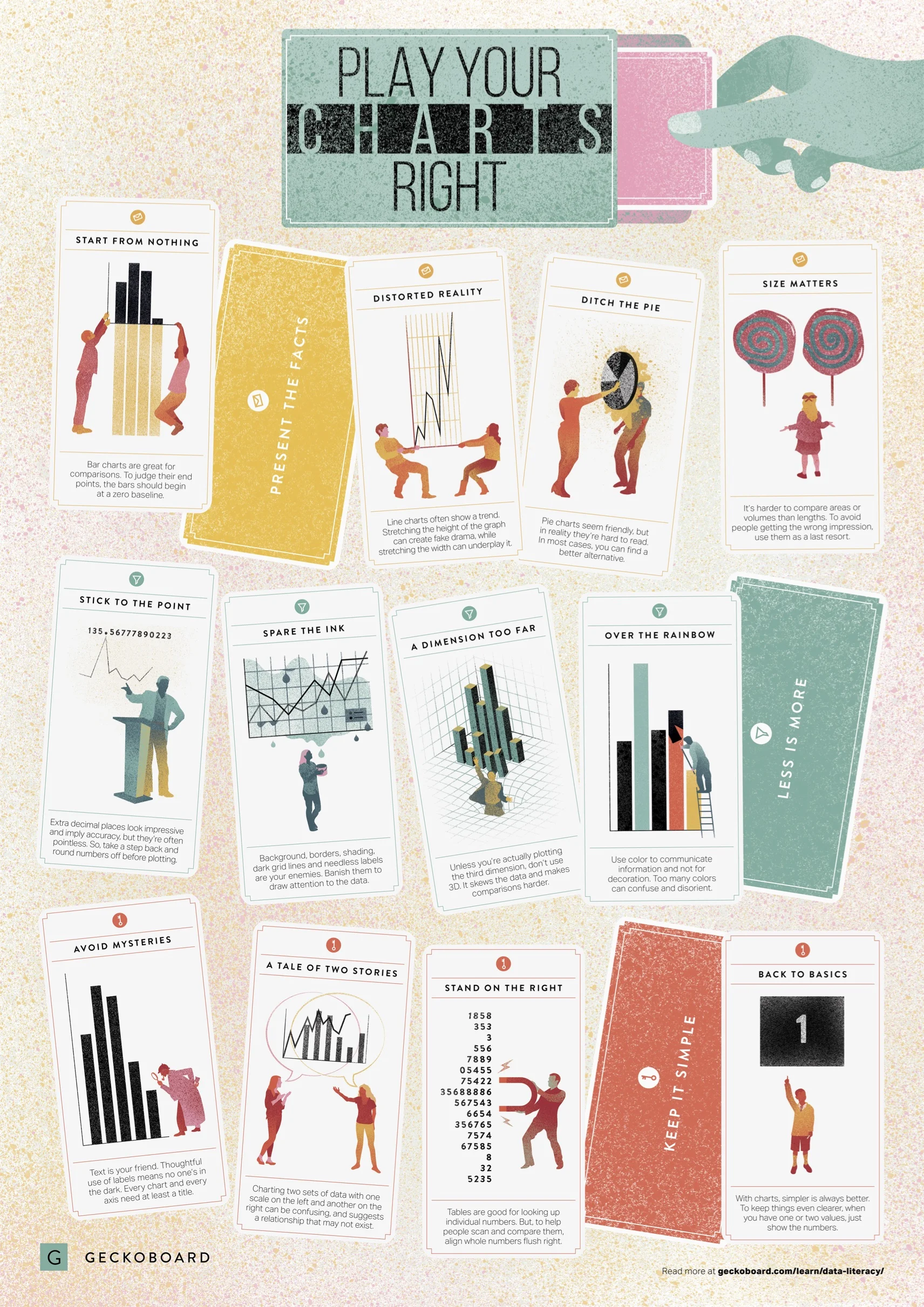
Play Your Charts Rights is a free, downloadable PDF poster with 12 great data visualization tips from Geckoboard. They will also send you a print poster upon request! Hang it in the office as a constant reminder for your team!
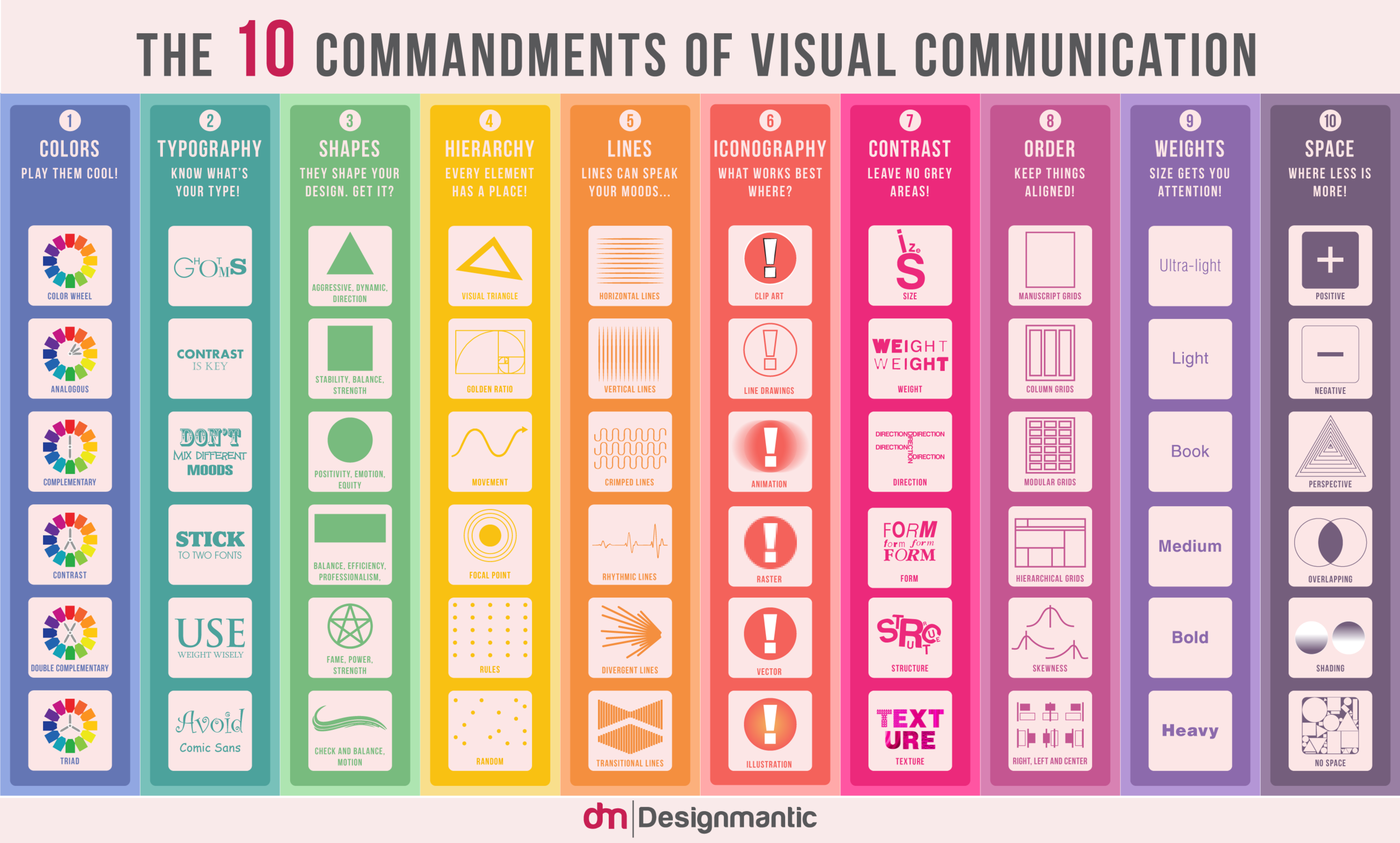
High-resolution image file you can download and print. It outlines the various aspects of visual communication and sums them all up to perform as a complete guide to the art of designing, be it generating a creative logo design or developing a user-friendly website interface. The layout of the infographic lists typography, color, shapes, hierarchy, lines, iconography, contrast, order, weight, and space as the 10 commandments, and gives out the different applications of these w.r.t. design and visual presentation.

From Data to Viz is on online, interactive chart chooser that leads you to the most appropriate graph for your data. It also links to the code to build it (R, Python and D3) and lists common caveats you should avoid.
Also available as the poster shown. You can download the high-resolution image or Buy the Printed Poster

How to choose the right chart? The Chart Chooser Infographic poster presents your chart options in a clear and visible way. The right chart will help you tell the story behind your data. The Chart Chooser Infographic poster from Stephanie Evergreen is available for purchase from the chartchoosercards.com site.

Sort through data noise and clear chart clutter. The cards are a simple tool to help you simplify, clarify, and amplify the way you create visual data and present it to your audience. Frame the data and you frame people’s thinking. The Chart Chooser Cards from Stephanie Evergreen are available for purchase from the chartchoosercards.com site.

Stephanie Evergreen and Jennifer Lyons collaborated to create the Qualitative Chart Chooser as a downloadable PDF to help researchers working with text, concept sand relationship data where traditional charts don’t apply. Version 2.0 includes two pages with a visual display of the chart types and decision matrix to help choose the appropriate display of information. There is also an updated Version 3.0 of the decision matrix.

Steve Franconeri created a different type of ‘chart chooser’ reference called experCeption that’s based on the structure of the plotted data. Read his article explaining his new methodology.
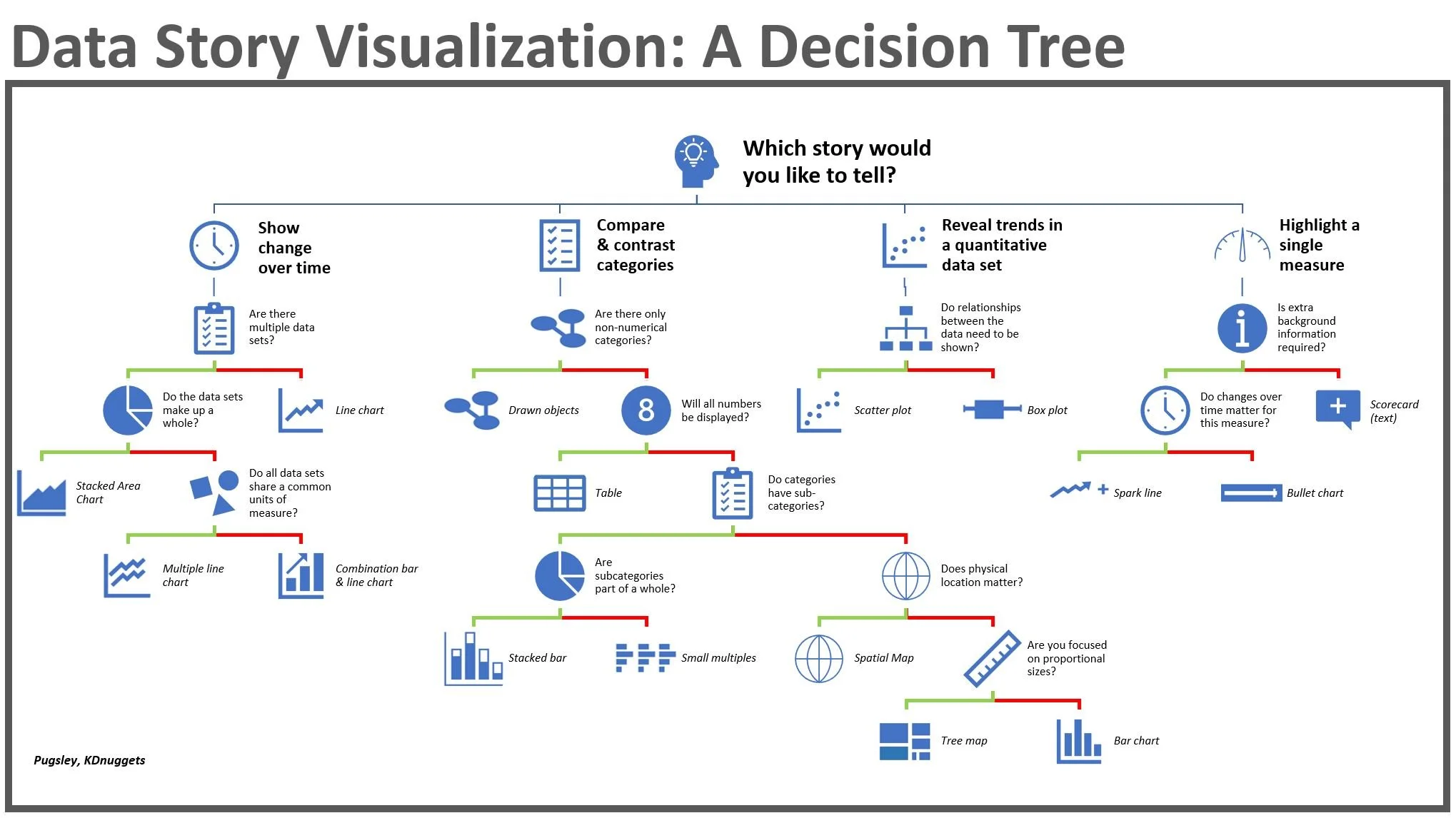
Stan Pugsley published this data visualization decision tree and a full explanation article.


