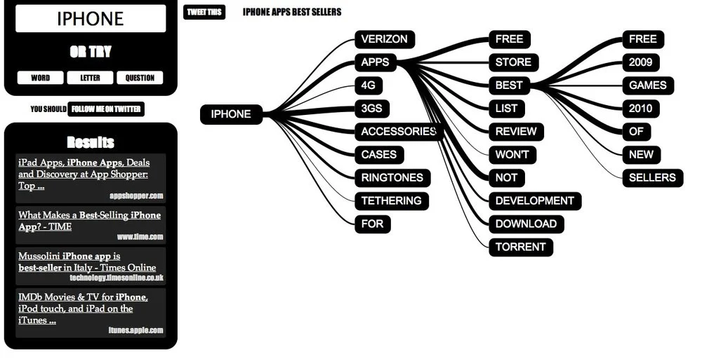
Using a mindmap-style visual interface, WhatDoYouSuggest.com shows you the search results from Google in an easy-to-use interface. Created by Simon Elvery, the interface returns the top words that Google suggests based on your initial query. By clicking on the relevant words, the search becomes more relevant, and more words are suggested to narrow your search.
Both the order of words and the thickness of the lines are meaningful. More detailed information is available on the Simon’s blog.
What Do You Suggest takes a seed from you (or gives you something random) then guides you on a journey through language and the collective lives of Google users.
Using data from Google to make suggetions on where you might like to go next, What Do You Suggest is an experimental and interactive environment designed to explore how we use language and search on the internet.
The words that appear first in each set of options are the words Google thinks are most likely to be what people are looking for.The words joined by the thickest lines are ones which will produce the most results if you searched for them on Google.
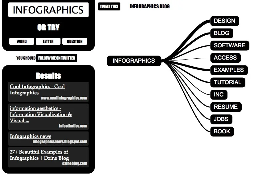
Of course, I had try see what “infographics” cam up with…
Found on Information Aesthetics and Gizmodo.


