Cooking for Engineers...recipe infographics! (and interview)
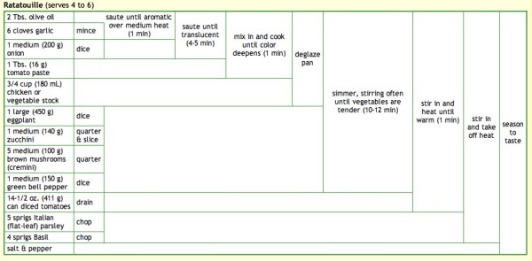
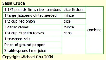
Michael Chu has been running the CookingForEngineers.com site for 6 years now, and he developed this infographic recipe table using HTML tables. His recipe table is essentially a timeline of making that particular recipe, but also lists every ingredient, ingredient amounts, recipe instructions and the points in time they are added to the dish. All in one, compact visual image. Outstanding!
Michael also demonstrates each step of the recipes with pictures so you know what it should look like when you attempt the recipe.
Michael was also nice enough to answer a few interview questions I sent him:
Cool Infographics: What software applications do you use for the recipe graphics?
Michael: I use a text editor and write the HTML for the recipe tables by hand. For the graphics used on my business cards and T-shirts and other merchandise, I copy and paste the browser rendered table into excel for some slight tweaking. Then I copy and paste into Adobe Illustrator for final adjustments.
Cool Infographics: What was your inspiration behind developing the recipe graphic?
Michael: I developed it on my own based on a shorthand notation that used for years to write down recipes on Post-It notes involving curly braces and actions scrawled on the side.
Cool Infographics: Have there been any recipes that have been particularly difficult to visualize?
Michael: Some recipes, especially ones involving discarding part of the ingredients and reintroducing ingredients at various points in time do not lend themselves to the recipe summary table.
Cool Infographics: What’s your most complicated recipe graphic?
Michael: It’s hard to determine… most recipes don’t come out all that complicated. The real trouble is that sometimes browsers act funny and start sticking in vertical or horizontal lines where they do not belong.
http://www.cookingforengineers.com/recipe/227/Ratatouille
http://www.cookingforengineers.com/recipe/60/The-Classic-Tiramisu-original-recipe
Cool Infographics: I keep calling it a recipe graphic, what do you call that visual style?
Michael: I call them either recipe summary tables or Tabular Recipe Notation (TRN).
Cool Infographics: Have you seen anyone else start to use that type of visual graphic for recipes?
Michael: After I started using it, I have had a few people email asking permission to use the format for their own recipe books, etc.
Cool Infographics: How long have you been running Cooking for Engineers, and have you been using that recipe graphic the whole time?
Michael: Cooking For Engineers has been up and running since June 2004 and we’ve been using the table from day one. Incidentally, the first recipe posted is this one:
Check out all of Michaels’ recipes at CookingForEngineers.com


