Visualizing the Internet - infographic treemap
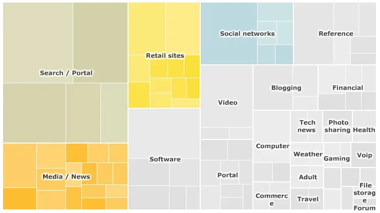
For their article, SuperPower: Visualising the Internet, the BBC created a treemap of the top 100 websites on the Internet based on unique visitors during the month of January 2010.
On the interactive version on the BBC site, you can mouse-over any of the site squares to see a pop-up of the numbers behind that site and choose to view each category individually. The spreadsheet of the raw data from Nielsen is also available for download.
The data used to generate the interactive treemap visualisation were collected by the Nielsen company and covers the UK, France, Germany, Italy, Spain, Switzerland, Brazil, US and Australia. The figures represent unique users for the month of January 2010.
The categories - such as retail, social networks, search/portal - were defined by the BBC. Because some websites have more than one use, they could fall within more than one category (e.g. Yahoo). However, the treemap only classifies them once.
The maps were produced using the Prefuse Flare software, developed by the University of California Berkeley.


![The State of the Internet [infographic]](https://images.squarespace-cdn.com/content/v1/5bfc8dbab40b9d7dd9054f41/1554169226215-K3HV9DE4NJYQI2IZB15Y/Safari.jpg)