White House Infographic: The Resurgence of the American Automotive Industry
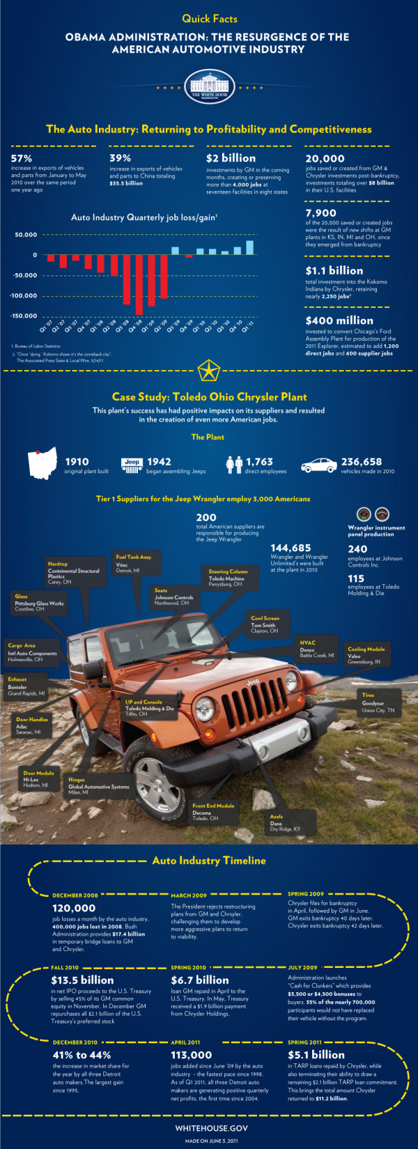
The team at the White House released The Resurgence of the American Automotive Industry infographic on the White House Blog last week in conjunction with President Obama’s visit to Toledo, OH and the JEEP manufacturing plant there.
Today, President Obama will travel to Toledo, Ohio where he will visit the Chrysler Group’s Toledo Supplier Park – an operation that employs more than 1,700 workers producing Jeep Wranglers, Jeep Liberties, and Dodge Nitros. Just two years ago, Chrysler was filing for bankruptcy, and President Obama made the tough decision to support the restructuring of the company rather than allow it to fail – which would have cost tens of thousands of American jobs.
Today, Chrysler is repaying its government loans six years ahead of schedule and posted five consecutive quarters of operating profit. Earlier this week, the National Economic Council released a new report on the resurgence of the American automotive industry. Over the past two years, the auto industry has added 113,000 jobs - the fastest pace of job growth in the auto industry since 1998.
Check out this infographic that highlights some of the key successes in the auto industry since 2009.
I wrote a long critique of the last White House infographic about Obama’s Energy Plan (The Obama Energy Agenda: The White House attempts an #Infographic). This one improves on some of the design issues I had with the last one. I like that the White house is being consistent with the design style, and you can tell at a glance that this one is obviously in the family of official infographics from the White House.
Citing sources is still an issue for these infographics from the White House. There are two sources cited and referenced, but many more statistics are included without any source. For example, where does the “39% increase in exports of vehicles and parts to China” come from? There are many statistics that could have been visualized to reduce the amount of text as well. Listing a bunch of numbers in bold text doesn’t make for a good infographic design.
I love the inclusion of the Jeep photo with information mapped on top. Much more interesting and engaging to the reader than what could have been a list of 17 suppliers, and more interesting than plotting them on a map of the U.S.
The timeline is pretty boring. The dotted line could have been tire tracks, and way too much text that could have been data visualizations.
Thanks to Mary Kaye for sending me the link!