The Content Grid v2
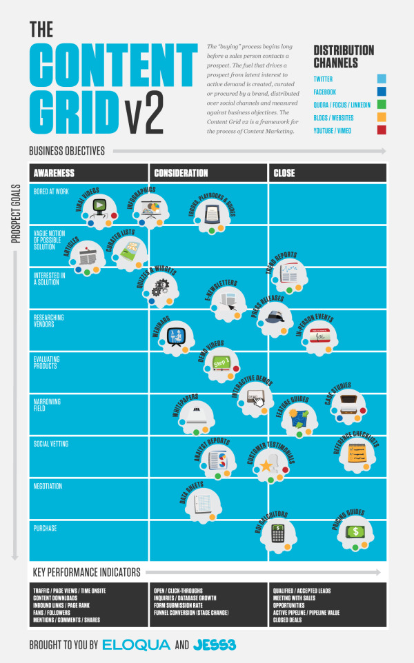
First, The Content Grid v2 is a cool, new infographic collaboration between Eloqua and JESS3. The infographic maps out the different ways that companies can deliver information to potential customers, how that content can effect the buying process and the different distribution channels for that information.
It’s a complex set of data, and this infographic does a fantastic job of summarizing the different tools available onto one page. This would work as a fantastic tool to use when planning a strategy to release a new product, and choosing the different ways you could successfully reach your customers.
The Content Grid v2 picks up where its predecessor left off. Intact is the prescriptive connection between content type and distribution channel. New is the perspective of the buyer, a multi-stage purchase funnel, and a comprehensive collection of KPIs (like they say, “What isn’t measured, isn’t purchased.”). Although v2 contains significantly more information than the original, the new design is infinitely more simple. This achievement is a tribute to the unrivaled design team at JESS3 – and the clarity of client/agency communication that comes only with time and trust.
Enjoy The Content Grid v2. It’s not only the next generation of the Web’s most popular and award-winning content marketing infographic, but it’s also a how-to for marketers looking to operationalize content marketing programs.
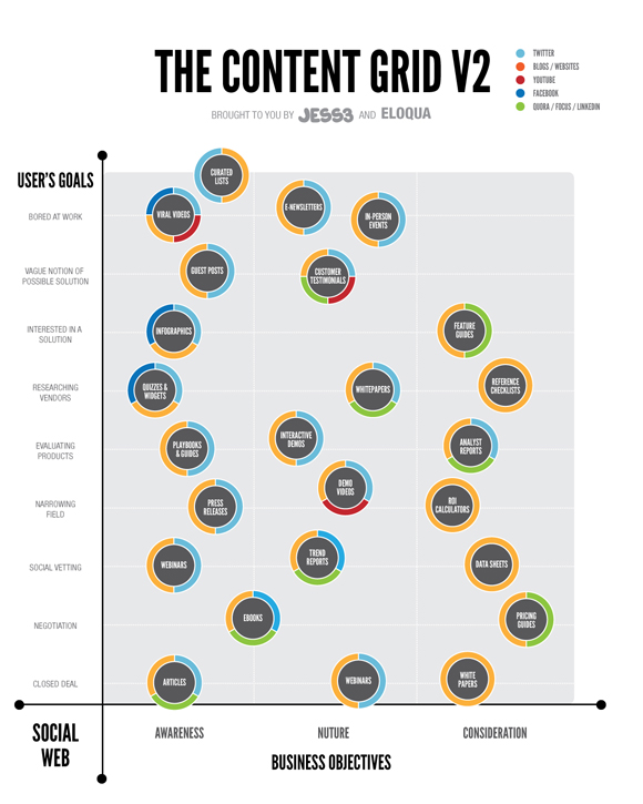
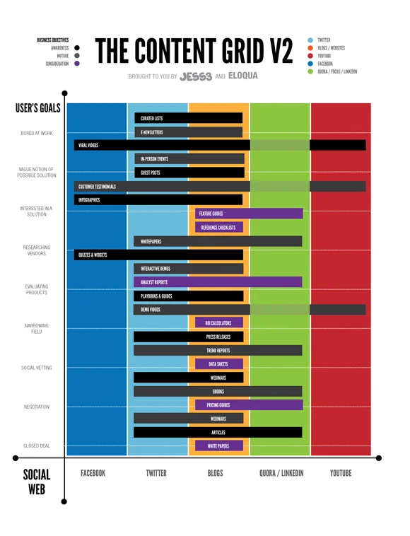
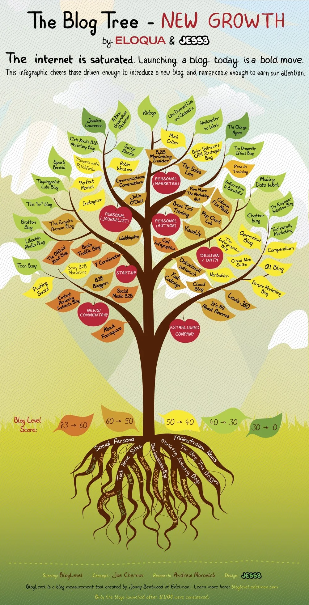
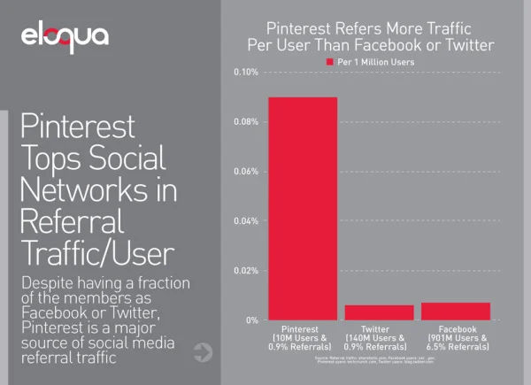
Second, Jesse Thomas, CEO of JESS3, has posted a good “The Making of an Infographic” article on Forbes.com looking behind the scenes at the infographic design process, and sharing some of the other design options that were explored during the process. A couple of the other designs are included above.
And finally, third, Joe Chernov has a good article about designing Planned Obsolescence into the infographic as an effective markleting practice. Eloqua and JESS3 released the original Content Grid (above) in June of 2010 knowing it was interesting data, but not quite useful yet as a tool.
We knew the graphic was interesting visually, and we also knew it could be used by marketers. But deep down we felt that something was “off,” but we couldn’t quite put our finger on what was wrong. We could have sat in the drawing room until it was “perfect” (translation: indefinitely), but we didn’t. Instead we published the content as-is and deliberately planned to revisit it one year later.
During that time, we solicited feedback (in blog comments, on Twitter, from colleagues, even from the audience at speaking engagements) and preserved all comments in a spreadsheet. By provoking widespread feedback (positive and negative), we were deliberately rendering obsolete the infographic we had worked so hard to develop.
A fascinating look at how infographics are made and used as effective marketing tools.


