HTML5: Past, Present, Future
The future is now! HTML5: Past, Present, Future infographic from Dot Com Infoway takes a trip trough time to explain how evolutionary HTML5 is.
HTML5 is the next evolutionary step for the Web world. With HTML5, the possibilities for Web usage are endless. At DCI, we are proud to be ahead of the game in offering HTML5 development for our many clients.
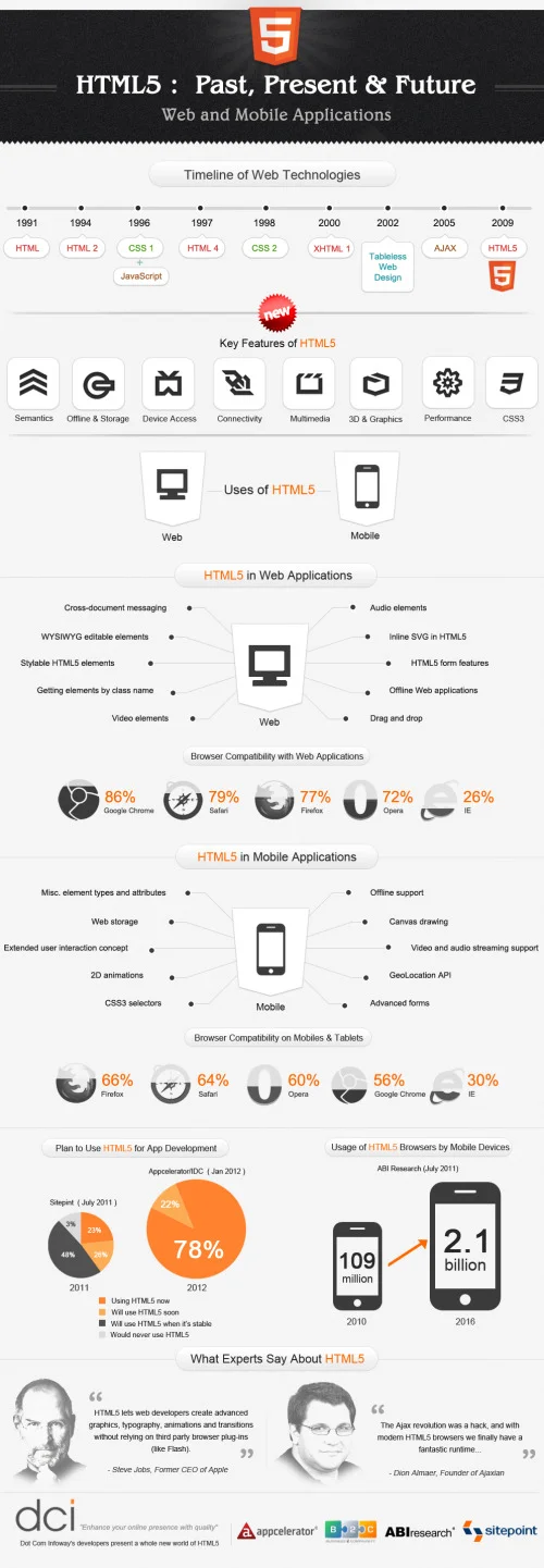
The published HTML5 infographic elucidates the history of HTML through an appealing timeline from its inception in 1990 to HTML5 in 2009. It also lists out the key features, uses and the role of HTML5 in Web applications in a captivating manner. The infographic also illustrates the compatibility of Web applications with various web browsers. It is interesting to note that Chrome and Safari maintain a higher compatibility rating than that of Opera and Internet Explorer.
Mobile applications are what we excel at. We understand how to create the most advanced apps through our development and work with our clients. Research indicates that by 2016, HTML5 usage with mobile browsers will surge to 2.1 billion. And by this year alone, the use of HTML5 in mobile application development has increased to 78%.
It is evident from the research data that HTML5′s trajectory will continue to grow to unbelievable heights in the near future.
This is a beautiful, clear infographic design. The color palette is kept simple, and the use of icons is fantastic.
From a data visualization perspective, there are a couple of things that would make the design even better:
It might be just my own taste, but I think the timeline should be laid out to match the correct spacing of the years. Visually it looks like some something happened every year on the timeline, when in reality each step jumps a different number of years.
Most of the data sources are cited in among the the visualizations, but no source is cited for the Browser Compatibility numbers. Where do these values come from? Are they believable?
Also in the Browser Compatibility, the shaded portion visualizations are wrong, and don’t match the values they are supposed to represent. First, because the icons are circles, you have to shaded the AREA of each shape to be true to the data. If you shade the height of a circle based on the data, the visual doesn’t match the values. Second, even shading them by height was done incorrectly. For example, Opera compatibility on Mobile is listed as 60%, but the visualization shows some number under 50%.
Found on Infographics Archive