Find the Best Airline Fees
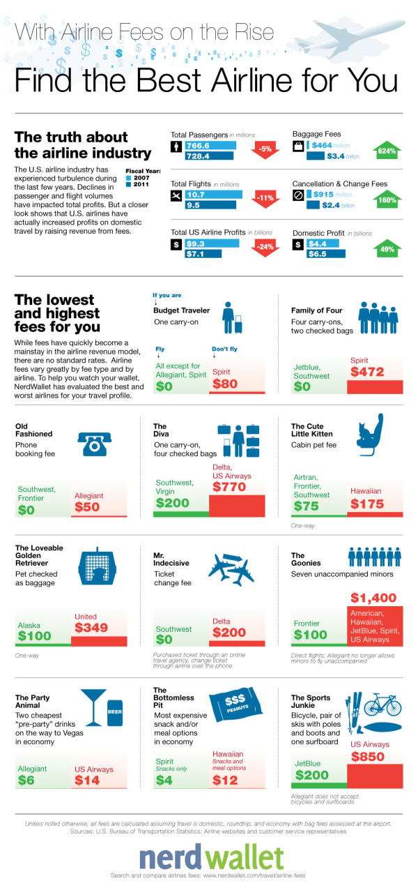
Traveling is a pleasure that we don’t want to give up, but costs keep rising! Find the Best Airline For You infographic from Nerd Wallet lets you know which airline to travel on depending on your traveling habits to keep the costs down!
U.S. airlines continue to increase fees - more fees and higher fees. However, there are no standards or regulations when it comes to airline fees so travelers don’t know what to expect. Fee prices range widely by airline, and there is little transparency on the terms of each fee. For example, some fees are charged based on how stops are made, while others are billed as flat fees. Some fees have a base rate but increase from the time of booking to boarding the plane.
As a result, cost comparison is extremely difficult, especially when travelers are evaluating multiple airlines. To make matters worse, fees are not properly disclosed – they are hidden within multiple layers on airlines’ websites and shrouded by vague wording. NerdWallet gathered the data and analyzed each fee across all major U.S. airlines. To help travelers save money, we defined several traveler profiles and calculated fees on a comparable basis to determine which airline is best (and worst) for each type of traveler.
There are a handful of things I like about this one.
The main thing is that throughout all of the Lowest/Highest comparisons, the scale of the bar charts is kept consistent. This allows the reader to easier understand how much money is related to each travel fee.
The green-red (good-bad) color scheme is instantly understandable to the reader.
The icons (all in blue) are easy to understand. By keeping them all a consistent solid blue color, they are kept simple and don’t create a bunch of “visual noise” that would distract the reader.
Sources are listed at the bottom
The direct URL to the original infographic is included at the bottom so readers can find the high-resolution original no matter where they find it posted on the Internet.
I would suggest using the airline logos, even in a solid color, to make it easier for the readers to pick out the airlines they recognize.
Thanks to Annie for sending in the link!


