


The Online Shopping Cart Experience
Online shopping is a convenience that a lot of people take advantage of. But the convenience varies. The Shopping Cart Experience infographic from checkoutoptimization.com finds the optimal situation to make customers happy.
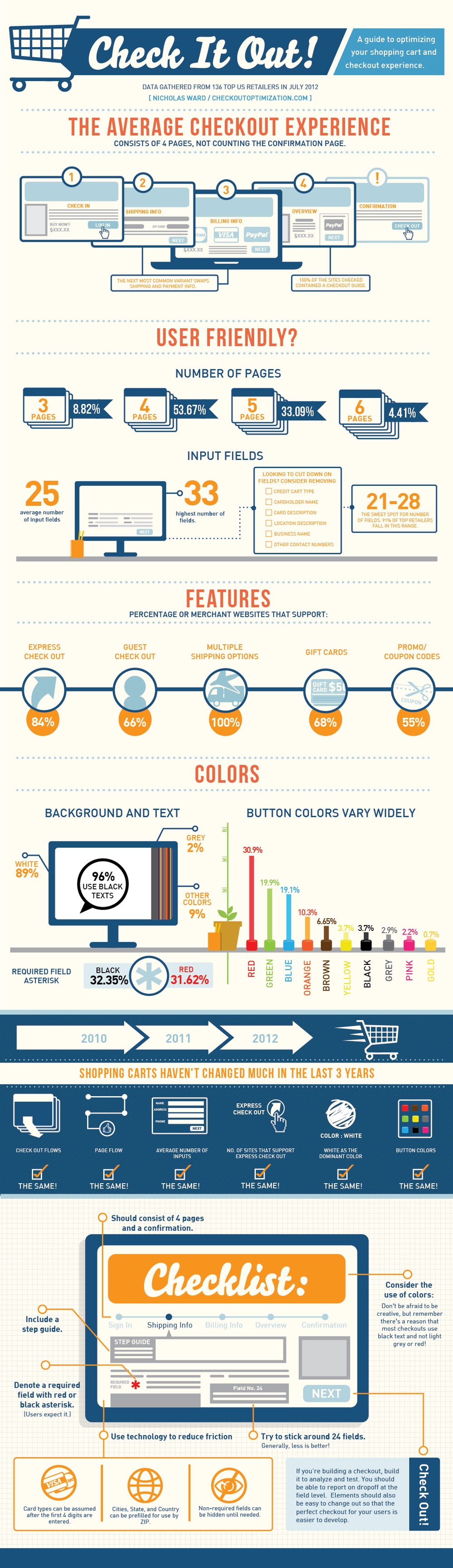
Over the course of the last few years, I have been in and out of the details of conversion rate optimization. My career at a digital marketing agency affords me the privilege of working with some of the top brands in the world. I am equally lucky to know some great entrepreneurs with very small businesses. Among the fascinating things that I get to see every day and across the spectrum is how much of an impact a small improvement at the checkout makes.
Simply, more sales equals more sales. Given finite resources to optimize a thousand different things, I’m awestruck that the shopping cart is not a greater focus. And as sites have changed in incredible ways over the last few years, shopping carts remain unchanged.
In 2009 I thought about this issue and started researching attributes across a number of shopping carts. It was a story of small diversity and great uniformity. I started writing a book on the subject, but I shifted focus to double down and grow a separate business. (Which has been extremely rewarding and I now get to work with a growing group of talented, bright, extremely funny people that are accomplishing amazing things for the world’s coolest brands, but that’s another story.) A couple of months ago, I came back to the idea of checkout optimization, and thought it would be really interesting to compare my 2009 research to the current state of things.
And that’s how this infographic came to be. My hope is that this is useful to anyone curious about shopping cart design patterns, or perhaps someone looking for a standard to measure up against. Let me know what you think, and you want more like this, you can sign up here.
Nice overview of the differences sites choose when setting up checkout pages on e-commerce sites. Some of the subtle visualizations work very well, like the multiple pages shown behind the numbers in the User Friendly section. However, some values aren’t visualized at all, like the percentages for the different merchant features.
The infographic landing page explicitly asks people to repost the infographic with links back to the original page, but sadly, most people don’t do that. The landing page URL should be included in the infographic image itself so readers can find the original when bloggers don’t include the link.
Thanks to Nicholas for sending in the link!


