Visualizing AOL's Return to Growth after 8 Years

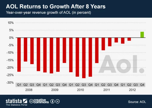
Sometimes you only need one data visualization or chart to tell your story. Statista recently published the infographic AOL Returns to Growth After 8 Years with only this bar chart of year-over-year revenue since Q1 2008, which clearly shows the last five years of quarterly losses.
This chart shows AOL’s revenue growth since the first quarter of 2008. In the fourth quarter of 2012, the former internet heavyweight returned to positive growth after 8 years of declining revenues.
The latest results mark a milestone in CEO Tim Armstrong’s quest to transform his company from an internet service provider into a digital media company. Since AOL’s spin-off from Time Warner in 2009, the company had acquired TechCrunch and The Huffington Post to re-position itself as an ad-selling provider of premium online content.
The above chart nicely illustrates the slow progress AOL has made in the past 2 years.
Not an infographic in the modern online interpretation of telling complete stories in one image file, but more in-line with the definition of infographics simply as “information graphics”.
I’m not sure why they didn’t show the complete 8 years of data in the chart. By only showing 5 years of data in the chart, they really didn’t support their claim that it has been 8 years of losses for AOL.
Found on Visual Loop.