Nathaniel Pearlman - What Makes an Infographic Cool?
Guest Post by Nathaniel Pearlman
Randy asked me to write a post on the topic “what makes an infographic cool?”
Unfortunately, I hate the term infographic. The first four letters feels too casual to me, but maybe it’s a good fit for quick marketing infographics. For my firm’s work, I prefer the terms “information graphic” or “data graphic” or “data visualization”… or “timeplot.” They seem more dignified. But then I’m a guy who insists on using the term “small, medium, and large” at Starbucks.
My quick answer is: an infographic is “cool” when it presents an important and complex story and does so with integrity and good looks. Important, because if the subject is not important, why bother? Complex, because it is complexity in information that requires visual treatment. Integrity is key for the long-term reputation of both client and design firm. By good looks I mean good aesthetic design, crucial for both pride in our work and the reception it receives from our audience.
(Perhaps an infographic graduates from “cool” to “warm” if it is especially good, and if one is really beautiful, which is quite rare, it could be called “hot” or “awesome” or “epic.” For this reason, I advise Randy to reserve warminfographics.com, hotinfographics.com, awesomeinfographics.com, and epicinfographics.com if they are not already taken). [Randy: Most are already taken]
Maybe my history explains my resistance to the term infographic. My route to practitioner in this field was quite indirect. A class I took in 1987 with Professor Edward Tufte sparked my original interest. At the time he had written only one book of his four classic books on the visual display of quantitative information. For that class, I hunted for historical examples of good statistical graphics in the stacks of Sterling library, and got the bug. But, though I continue to collect examples to this day, filling up my map drawers, it took me some twenty years of other activities (graduate school, founder of software company, CTO for presidential campaign, husband and father), before I started making Timeplots (www.timeplots.com).
Anyway, I’ve become pretty opinionated about what makes an information graphic cool. My strong preference leans to working with data and stories that have potential to impact public policy or to educate people about things they care about. In my view, this can be done by presenting information in a new way or pulling many threads together into a new tapestry. The form could be print, or a web-based interactive, or a motion graphic, but the work should fit the medium. The form of the graphic doesn’t have to be new or inventive, but should be the best fit for the information. I find it best to be attentive to others who are truly great at this craft, as I have much to learn.
I also prefer to work for the right side of an issue, as I see it, and to say something that matters. It’s not always possible (financially or otherwise) to find the right clients or projects to do this, but I much prefer to tell stories with data that hold the potential to make a positive difference in the world—not just to advertise a run-of-the-mill product or service. I aspire to execute work with integrity (to tell the truth with the data, to provide comparative context, to consider counterarguments, to truly explain).
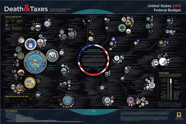
We are currently working, for example, with the Center for American Progress to help show how immigration will be economically essential over the next twenty years, and how public policy ought to be shaped with that in mind. Happy to have that project. My firm also provides yearly updates to the Death and Taxes poster on the Federal Budget. The 2014 version is just out and is available here: http://www.timeplots.com/collections/all
My consulting firm Graphicacy helps others tell complex stories visually(www.graphicacy.com). Our name (think literacy, numeracy, graphicacy) reminds us to take into account the abilities of our audience to understand the graphics we create.
Since we often work with complex data, this is particularly relevant, for unintelligible information graphics cannot be cool.
Nathaniel Pearlman has been interested in visualizing data for more than two decades. Nathaniel majored in computer science at Yale and he finished all but his dissertation in MIT’s political science doctoral program. Nathaniel founded NGP Software, Inc. in 1997 (now NGP VAN, Inc.) to join his interests in politics and technology and grew that company into the market leader in fundraising and compliance software for progressive political campaigns. Nathaniel served as Chief Technology Officer for the Hillary Clinton for President campaign in 2007-8. In 2009, Nathaniel founded the information graphic products company Timeplots and reserved the name GRAPHICACY for information graphics consulting and services. Together, Timeplots and Graphicacy are dedicated to making the visual display of information more comprehensible and aesthetic.
LINKS:
Graphicacy: graphicacy.com
Timeplots: timeplots.com
Twitter: @timeplots
Facebook: facebook.com/timeplots


