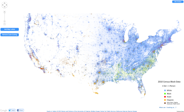
The Racial Dot Map

The Racial Dot Map visualizes the 2010 U.S. Census data, where every individual person is represented by a single, color-coded dot. The color coding shows the racial groupings gathered by the census.
This map is an American snapshot; it provides an accessible visualization of geographic distribution, population density, and racial diversity of the American people in every neighborhood in the entire country. The map displays 308,745,538 dots, one for each person residing in the United States at the location they were counted during the 2010 Census. Each dot is color-coded by the individual’s race and ethnicity. The map is presented in both black and white and full color versions.
The map was created by Dustin Cable, a demographic researcher at the University of Virginia’s Weldon Cooper Center for Public Service. Brandon Martin-Anderson from the MIT Media Lab deserves credit for the original inspiration for the project. This map builds on his work by adding the Census Bureau’s racial data, and by correcting for mapping errors.
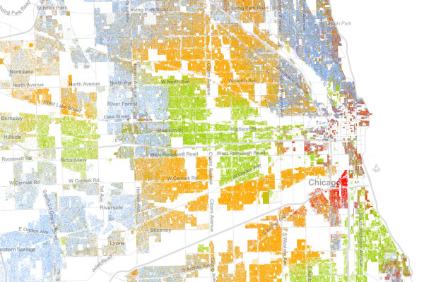
Each of the 308 million dots are smaller than a pixel on your computer screen at most zoom levels. Therefore, the “smudges” you see at the national and regional levels are actually aggregations of many individual dots. The dots themselves are only resolvable at the city and neighborhood zoom levels.
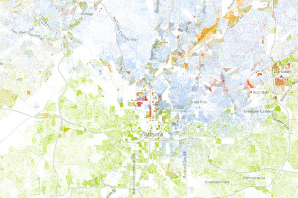
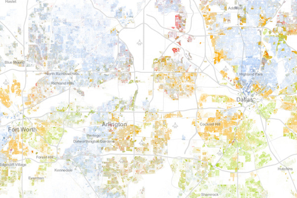
Each dot on the map is also color-coded by race and ethnicity. Whites are coded as blue; African-Americans, green; Asians, red; Hispanics, orange; and all other racial categories are coded as brown.
The map is an interactive, zoomable map online of the entire country, and allows you to explore any U.S. locations. Chicago is show above.
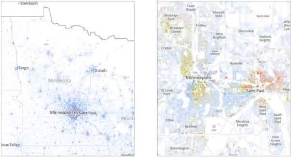
Since the dots are smaller that screen resolutions where the viewer zooms out, the data is aggregated to pixels at each level of zoom. The Minneapolis-St. Paul metro area is highlighted on the site as an example of the aggregation. You can see the more detailed dot pattern on the right at the higher zoom level.
I would love to see this added as a layer in Google Earth! Wouldn’t that be cool?
Thanks to Renee for sending in the link! Also, found on Wired.
Atlanta:
Dallas-Fort Worth:
The entire U.S.