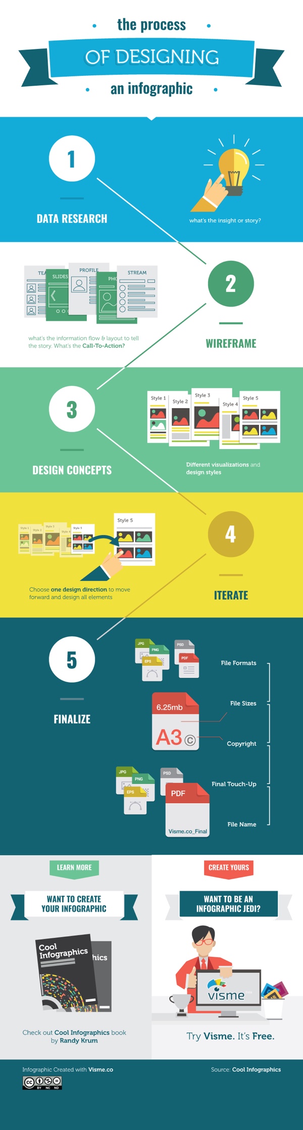
The World's Loudest Noises - An Audio Infographic

Loud noises can be unpleasant. But how loud is too loud? The World’s Loudest Noises is an interactive infographic from Air Conditioning Company that explains the loudest noises in the world and how much damage they could do to your ears. So next time your air conditioning kicks on and you feel like complaining… Just remember, there is always something louder.
Turn your volume down before you start clicking!
Our initial attempt to explain how loud air conditioners are via an internet page was, in our opinion, a minor disaster.
An indisputable fact is that 99.999% of us haven’t got a clue what a decibel either sounds like or looks like! Let’s be honest, we didn’t even know ourselves precisely what a decibel was!
So we started to delve into the dark world of decibels to make the blinking things easier to understand. We initially wanted to create an amazingly informative infographic to best explain how loud our air conditioners are. However, we didn’t know where the ‘cut-off’ point should have been and we got somewhat carried away until we found the worlds loudest noise!
Despite all of our in-depth research, noise levels and decibels are still controversial and subjective. We found so many different accounts of how loud the same sound was. Indeed, most of our research showed that an aeroplane taking off is louder than a spaceship launch and surely this cannot be the case. Further investigation revealed that people forget to mention how far away they were when actually measuring the sounds. Also, based in London, we don’t live close enough to Cape Canaveral to run around waving our own decibel meter…..
Have some fun clicking around on our all-singing-and-dancing infographic below. Those of you who wish for a more academic approach can scroll to the bottom to check out our initial research.
An audio infographic! This is a new way to create an interactive infographic. Each of the sounds listed in the infographic above is clickable to play an audio sample of each noise. It’s more fun and entertaining than actually representing the decibels because there’s no way your computer speakers (or your mobile phone speakers) can reproduce some of the decibel levels shown here. Plus you have volume control.
I’m really disappointed that the vertical scale is out of proportion. The sounds should be accurately placed along the decibel scale, not just evenly spaced no matter what the values are. That’s just poor data visualization.
There’s a sharing issue that happens with an interactive infographic like this one. I was bale to get the embed code from the publisher, so all of the click-to-play sounds should work here on Cool Infographics as well. However, most people that share the infographic will only grab the JPG image file or click the sharing buttons, and that loses all of the interactivity included in the code. The sounds also don’t work on many iOS and mobile devices.
What other infographic topics could include sounds?
Thanks to David for sending in the link!