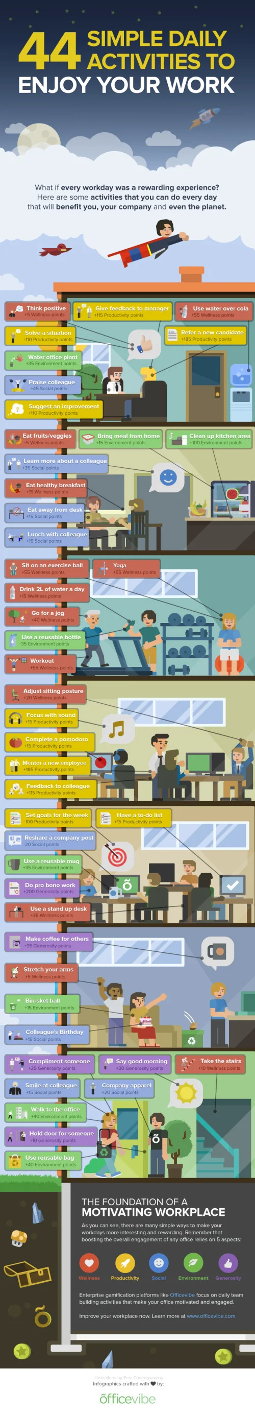
44 Simple Daily Activities To Enjoy Your Work

Here are 44 Simple Daily Activities To Enjoy Your Work created by OfficeVibe to help keep the motivation high and add some fun back in your work day!
You might think it’s a truism, but most people tend to forget this crucial fact:
You should always make the effort to build good habits that will make you healthier, happier, and more productive over time.
Also, when it comes to new habits, it’s important to remember that these are things to do for long term changes.
This infographic will give you an overview of 44 habits to improve your productivity, your health and the overall quality of your workdays.
A fun infographic for Friday! There is some fantastic information included in here. The topic choice will also have a long Online Lifespan, and has the potential to be relevant to readers for years.
The design is visually very busy. I understand the color-coding of the different activities, and those should be the visual highlight. The illustrations in the background should be less “noisy” with simpler illustrations and fewer colors. I might even consider making the background illustrations grayscale to make the 44 activities stand out even more.
The font choices in the text boxes seems too small, and clicking the image on the infographic landing page doesn’t open up a larger version. I think this was done to allow more of the background illustration to be visible, even though that shouldn’t be the focus of the design. The designer didn’t want all of their background illustration work to be covered up by the important information? This also made the great activity icons too small to understand.
The point scores for each activity were intended to add the element of gamifying these activities, but that gets lost in the overall design. There aren’t any score total categories, so there’s no benefit to the readers from adding up their scores.
The additional text on the infographic landing page is a little out of control. Every one of the 44 activities has a few paragraphs of text on the page providing more details. WAY more information that readers will stick around for, but thankfully they kept that separate from the infographic design.
The infographic should include the URL to the landing page so readers can find this additional information about the activities as well as the original, full-size version of the infographic. They include the URL to the OfficeVibe home page, but there are no links to the infographic there.
Thanks to @JacobShirar on Twitter for sending in the link!