Born in 2010: How much is left for me?
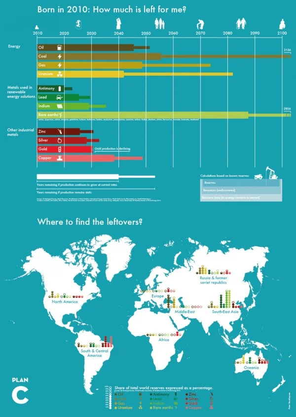
Resources are running low. The Born in 2010: How much is left for me? infographic puts the amount of each energy resource, metals used in renewable energy solutions, and other industrial metals left in perspective and which country to find them in. The infographic was created by Plan C.
I like the timeline design at the top. Graphing the remaining resources is much more effective than telling someone in text that there are only 35 years of oil left. However, I find the map visualization at the bottom confusing. The color-coding and odd range of filled circles is difficult for readers to comprehend.
Found on Visual.ly


