Starbucks Espresso Infographic Advertising
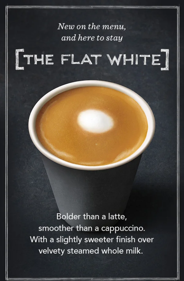
NOW AT STARBUCKS! The newest addition to the Starbucks menu is the Flat White. But what is the difference between The Flat white and the rest of Starbuck’s menu?
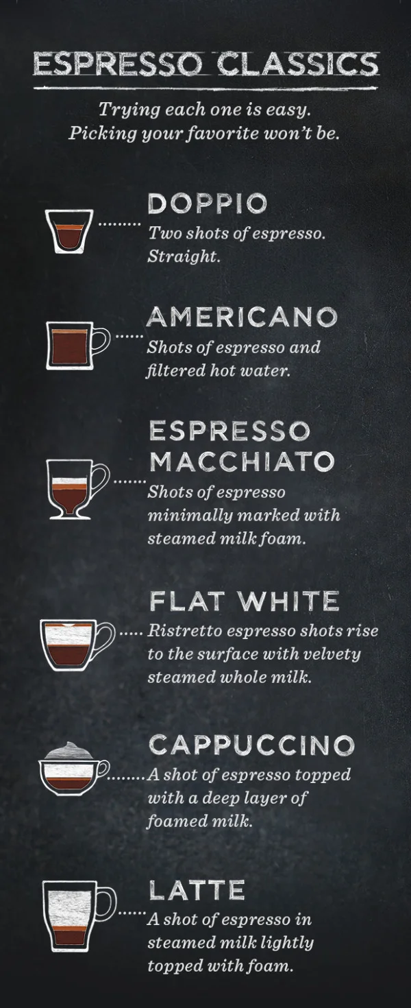
Starbucks sent this cool infographic as a content marketing piece in an email to all of their customers introducing The Flat White to their menu. The infographic visualizes the recipes for the 6 Espresso Classics. Currently available for view in most Starbucks stores around the country is an infographic that explains the differences between the styles of drinks on the menu.
The graphics in the email are actually the 3 separate images you see above, and I assume they could be changed for different people receiving the email. For example, someone else might receive an email about the Cappuccino or a different coffee flavor ad at the bottom. Good for flexibility in the emails, but bad for sharing in social media.
A product of simplicity, crafted into artistry, our baristas know that balance is key to the perfect Flat White. An extra ristretto shot ensures that it’s bolder than a latte, yet steamed milk keeps it smoother than a cappuccino. But perfection doesn’t end there—the technique for steaming and pouring the milk requires close attention as well. Steamed milk is folded into itself creating a velvety microfoam that gives the Flat White its silky texture and signature white dot.
Love the cafe-style chalkboard look, and the layered drink r recipe visualization design!
Using this infographic in an email campaign is brilliant, but I wish it had been designed to also stand on its own so it could be shared online in social media easier.
They use this design style throughout their entire espresso menu of drinks.
Thanks to Starbucks for sending the infographic to it’s customers! I put the separate pieces together below to make sharing easier!


