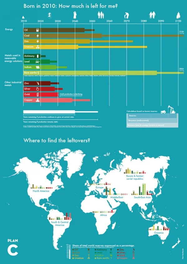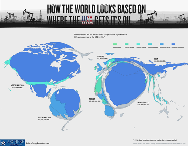
Where The USA Gets Its Oil

Two data visualization maps from Aschere Energy Education that show Where The USA Gets Its Oil.
The area cartogram created with a Gastner-Newman diffusion based algorithm is used to resize the countries above. It's a fun and unusual visualization method that stands out and gets attention because it breaks our usual understanding of the world map.

The second map uses the 3D heights of the countries and color-coding to represent the oil & petroleum exports to the U.S.
Thanks to Joe for sending in the link!