


What Happens on YouTube in 24 Hours?
What Happens on YouTube in 24 Hours? is an infographic that Pexeso created after taking an in-depth look into daily uploads on YouTube during the month of October 2015. Pexeso is a company that is designed to help you find your videos from multiple platforms across the web so you can better understand your virality.
It’s no secret that video is quickly becoming the #1 priority for both social media platforms and marketers alike. As consumers, we spend more and more time glued to our smartphones watching one video after another. By 2017, it is estimated that video will account for 74% of all internet traffic in the world, making the upcoming year make or break time for any company that’s betting on video.
As competition heats up, some of the most well-known platforms have rushed to report impressive statistics. While they may be staggering, such numbers tend to be cherry-picked and don’t necessarily show the full picture.
We at Pexeso are committed not only to delivering the best possible service to our customers, but also bring more transparency to this inherently non-transparent market. As we independently crawl many popular sites, we've been able to uncover some remarkably interesting, in-depth insights that we want to share.
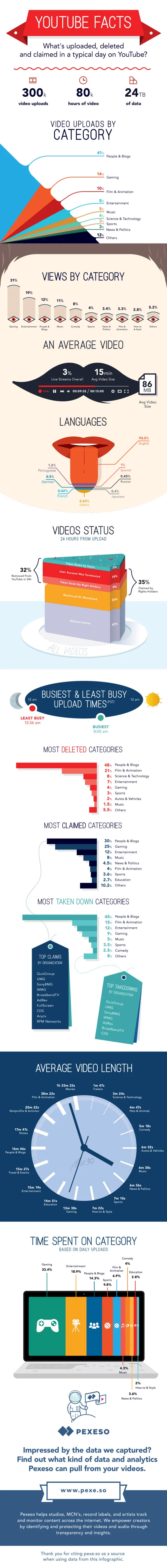
I appreciate seeing most of the statistics visualized, but a couple of the visuals do not accurately represent the data.
The Video Uploads by Category took a creative spin on what should have been a quarter pie chart. By taking the slices out of a triangle instead, the area of the slices at the ends is oversized and is misleading to viewers.
The Languages visual of sections on the tongue, under represent the size of the values by only using the height in an odd shape. The lowest section where the tongue is narrower don't have enough area to accurately show the data.
The 3D stacked bar in the shape of a cake, way over emphasizes the 5% Taken Down by Users by also showing the area of the top of the cake.
The clock visual doesn't represent the data at all. It's confusing for readers to have evenly spaced ticks around the clock, but widely varying times in the text.
The citations for the data sources are missing from the infographic. They're listed on the landing page in text, but infographics are usually shared without the original text from the publisher.
Thanks to Lisa for sending in the link!


