The Mother of All Mother's Day Infographics
Your Guide to the Business of Mother's Day may be the reigning Mother of All Mother's Day infographics from TheShelf.com covering practically everything you'd ever want to know about the business of Mother's Day. However, the data visualization portions need some help.
Mother's Day is right around the corner, creeping up on both consumers and brands alike. And even though, year after year, the majority of presents are bought super last minute, our spending on Mom is off the charts!
...And why shouldn't it be, the wonderful women in our lives are worth everything that we can throw at them (assuming it's good) on their special day, and that's why we've created this pretty huge rundown of all things Mother's Day.
This is a data-heavy infographic that breaks my 5-second rule. Instead of trying to tell one story really well, they threw in every bit of data they could get their hands on. They have so many sections, it's worth taking a closer look at a few to see what we can learn from the design choices.
The dedicated landing page is very well put together! Plenty of text for SEO and custom wording in the social sharing buttons and even custom social images to make sharing the infographic super-easy for readers! My only complaint is that they aren't sized for the social media sites. Twitter needs images with an aspect ratio of 2:1.
Let's take a closer look at one of the sections:
When you mix some data visualized and some data shown in text alone, the visualized data is perceived as more important to readers. These data points shown in just text is usually ignored by readers because it wasn't important enough to visualize.
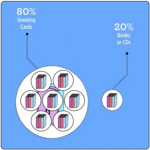
If you follow me, you'll know that I have a specific pet peeve with designers getting the sizes of circles wrong when used to visualize data. [See False Visualizations: Sizing Circles in Infographics]
The circles is this design don't match any of the data. I'll demonstrate here. The total area of Greeting Cards at 80% should be exactly four times the area of the The Books circle at 20%. However, you can see here that I can easily fit seven of the Books circles in the Greeting Cards circle with much more room to spare!
The data may be good, but the visualization is all wrong. It looks like the designer was eye-balling the sizes instead of actually visualizing data. Things like this make me skeptical, and begin to question every other visualization in the whole design.
Let's look at another section:
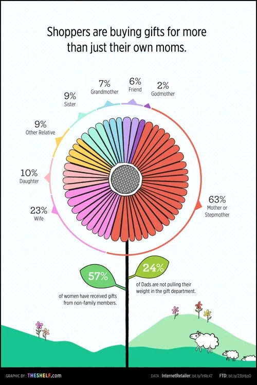
The flower is a pie chart, so it needs to follow the Golden Rule of Pie Charts! It MUST add up to 100%! However, this flower/pie chart adds up to 129%! What??? The 63% section by itself should be more than half of the flower, but it's shown as less than half.
One you start looking you'll find more problems. Why is 84% represented by 51 out of 56 people icons? That's 91%. Separately, why would you choose 56 icons to represent the total of 100%? Use 100 icons!
Lots of good data included in this infographic, but the design needs to go back to the drawing board.
Thanks to Sabrina for sending in the link!


