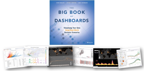
The Big Book of Dashboards!
The Big Book of Dashboards is a fantastic new book release in 2017 co-authored by Steve Wexler, Jeffrey Shaffer, and Andy Cotgreave. Published by Wiley, the book is available in print and ebook. You can check it out here on Amazon!
The book starts with good data visualization design practices and then dives into 28 case studies of real dashboard designs in practice. The case studies are design tool agnostic, covering good dashboard designs from a variety of design tools. It doesn't matter what software you use, you will find inspiration and great examples in this book!
I met the co-authors at this year's Tapestry Conference, and interviewed them about the book below.
This month (June 2017) I'm giving away one copy to a lucky winner! Register on the Giveaways Page by June 30th to be entered.
Who is the book intended for?
Steve Wexler: Anyone tasked with building or overseeing the development of business dashboards.
The three of you are in distant locations from each other. What was your process to collaborate on writing the book?
Steve Wexler: It wasn’t just the three of us! While we were the authors, the book has 17 contributors and we would have web-sharing sessions with all of them so we could understand the rationale behind the dashboards. There were also many cases where we would ask them to either defend their decisions or make some refinements.
In any case, we web-conferenced and relied very heavily on Slack to handle asynchronous collaboration. The slack channels are massive (you should see all the discussions on the definition of the dashboard).
Andy Cotgreave: We also used Join Me for teleconferencing and Dropbox for file sharing. Looking back, it’s incredible how technology facilitates close collaboration across the world.
How do you define what is a dashboard?
Steve Wexler: A dashboard is a visual display of data used to monitor conditions and / or facilitate understanding. Yes, it’s a broad definition.
Jeff Shaffer: There were long discussions on this one. We really considered Stephen Few’s definition, but picked apart terms like “single screen” and “monitored at a glance”. For example, does printing a dashboard and taking it into a meeting disqualify it from being called a “dashboard”? We think it’s still a dashboard and while it may not be used to monitor something in that instance, it does facilitate understanding. Another example is a “dashboard” that is presented on a tablet or phone where scrolling off a single screen is necessary. Technology, and screen size, is constantly changing, so while our definition is broad, I find it more accurate.
Why should dashboards be elegant or visually appealing?
Steve Wexler: I guess for the same reason that your want a computer, phone, appliance, etc., to be elegant or visually appealing. For certain, the dashboard must first be functional (i.e., inform, enlighten, and engage) but the “engage” part is more likely if the experience with the dashboard is pleasant.
Andy Cotgreave: You need people to engage with a dashboard. Don Norman defines success according to three levels of processing: Visceral, Behavioural and Reflective. Each needs to succeed. The first response is Visceral - it’s an instant emotional reaction to whether you like something. It takes little effort to ensure the colours, fonts, layout of a dashboard is appealing, but it’s vital to get that visceral response right. The “functional” part comes next, in the behavioural level.
Do dashboards have a size limit? How large can they go?
Steve Wexler: They should be bigger than a bread box and smaller than the Empire State Building. Goodness, it depends on so many things -- the audience, the platform (desktop vs. tablet vs. mobile) and so on.
Looking at the 28 scenarios in the book, with the exception of the Financial Times Economy at a Glance dashboard, none of the desktop-based dashboard have any scrolling (many of the mobile-dashboard do provide for scrolling).
As for the number of distinct charts on a dashboard the examples run from as few as one to around a dozen.
Interestingly, two of the examples that have a dozen or so charts are from Dundas, but because they are elegant and visually appealing you don’t feel overwhelmed by them.
Andy Cotgreave: Traditionally I’d have said they should fit on a single screen. But as mobile takes over, I think that is changing. The Financial Time Economies at a Glance dashboard is very very tall and designed for scrolling. It works extremely well on mobile. A starting rule of thumb would be to try to keep everything on one page.
How do you address the challenge of choosing the right type of chart for a given data set?
Steve Wexler: That is the raison d'être for the book! Given a particular predicament / scenario, and given the data you have, what is the chart or combination of charts that shine the most, brightest light on the subject? That’s what we’re trying to do.
And very often that chart or combination of charts may not be what you expect. Andy wrote a terrific chapter on visualizing time and shows there are so many cases where you don’t want to use a line chart.
Jeff Shaffer: It all starts what you are trying to show with the data. Presenting time is a great example. We have an entire chapter devoted to the different ways to show time, i.e. data over time. Typically a line chart would be a great way to show trend over time, but there are many other ways to visualize time.
What are the key mistakes people make in their dashboards?
Steve Wexler: Too much clutter and not enough clarity. Plus we’ll often see people putting too much emphasis on decoration and not enough on information.
Jeff Shaffer: The misuse of color. People using color incorrectly or in an overwhelming way. We talk in depth about this in the opening chapter and throughout the book in many of the examples.
What advice would you give young professionals just getting started with visualizing data?
Steve Wexler: Seek feedback when building dashboards. You need to meet with your audience, often, to make sure what you’re building actually helps the intended audience.
What’s available for readers on the bigbookofdashboards.com site?
Steve Wexler: There are links to articles, podcasts, and workshops. We’re also posted downloadable versions of many of the dashboards featured on the book.
Where can people follow all of you online?
Jeff Shaffer -- @highvizability, www.dataplusscience.com
Andy Cotgreave -- @acotgreave, gravyanecdote.com
Steve Wexler, @vizbizwiz, www.datarevelations.com
Are there any events coming up related to the book?
Steve and Jeff are offering a workshop in Atlanta on June 14 and will be offering more workshops throughout the year (See http://bigbookofdashboards.com/workshops.html)
Andy, Jeff, and Steve will be offering a free webinar on how to build world-class business dashboards on June 21. (See https://www.tableau.com/learn/webinars/big-book-of-dashboards)
We will all be at the Tableau Conference in Las Vegas, presenting sessions, and signing books!


