Popular Techniques for Visualizing Qualitative Data
Qualitative data (sometimes referred to as unstructured data) is virtually any information that can be captured that is not numerical in nature. This data needs to be visualized differently so audiences don’t perceive it to be quantitative data.
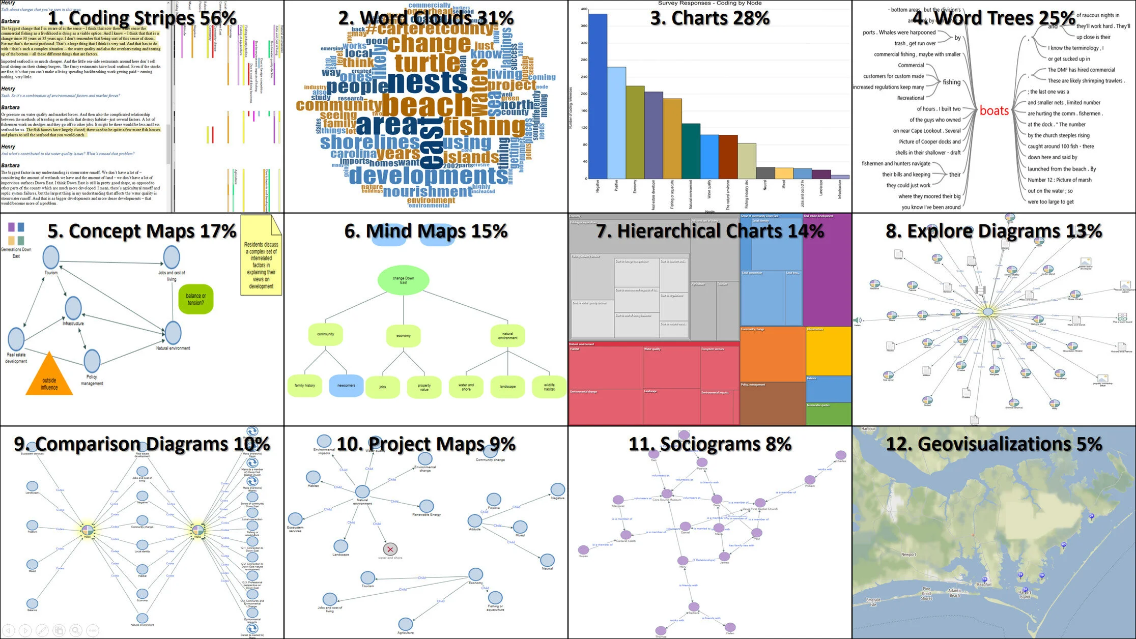
In early 2017, QSR International conducted a survey on SurveyMonkey with qualitative researchers around the world from academia, health, not for project, government, and enterprises. This blog post looks at the 1,020 survey responses, focusing on popular techniques for Visualizing Qualitative Data; those visualizations that are regularly used, those visualizations that are used to explore or gain insights, and those visualizations that are used to report on or share information.