


Thoughts on Zero Baselines
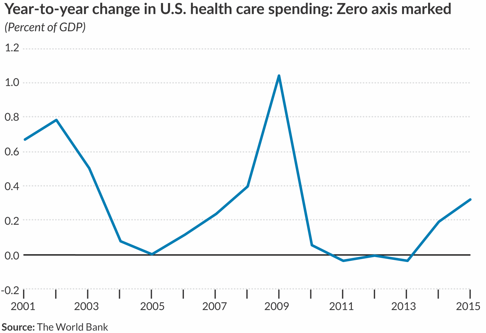
There isn’t necessarily a “correct” way to style your axis lines or gridlines in our data visualizations. It is worth noting, however, that how we draw our axes can impact how our readers perceive specific values. In the case of a line chart, for example, we are probably inclined to think that the bottom of the vertical axis is zero. In some cases—especially where the data series are both positive and negative—this can be especially important.
Click here to read more from Jon Schwabish on Zero Baselines.

