How to Make a Scatter Plot in Excel
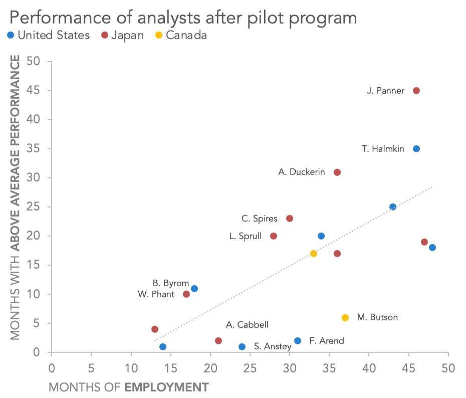
Scatter plots are excellent charts for showing a relationship between two numerical variables across a number of unique observations. We see them in business communications from time to time, although they’re much more commonly used in the “exploration” part of the process—when we’re still trying to understand our data and find the important insights.
how to make a scatter plot in Excel — storytelling with data