Color Harmony in Data Visualization
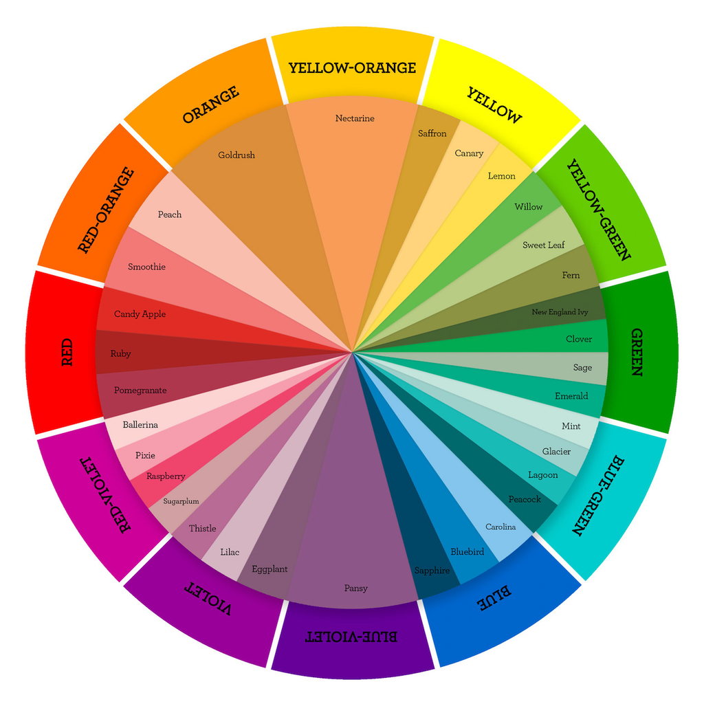
Data visualization is the practice of translating information into a visual context, to make data easier for the human brain to understand and pull insights from. We create a story with visualization, and we narrate this story to the people. However, aesthetics also plays a significant role in this process if we are to leave the desired impression and present the intended message well. The minute we look at most data visualization examples, it becomes evident that aesthetics is not given as much importance. And to better demonstrate what we want to tell in these stories, we should resort to the magic of colors.