Showing now versus then? Consider using a comet chart — Cool Infographics
Randy KrumDesigner | Author | Instructor | Speaker

Randy Krum

Designer | Author | Instructor | Speaker


Cool-Infographics-Book-Cover-White.jpg

FREE Sample Chapter

Showing now versus then? Consider using a comet chart

Showing now versus then? Consider using a comet chart

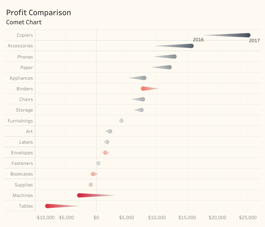
Will the Comet chart replace Gap charts in Steve’s practice? In discussing this with Andy Cotgreave they both agreed that you couldn’t use a Comet to compare purely categorical items; for example, the percentage of people that prefer Coca Cola to Pepsi, because there is something diminutive about the tail of the comet.

Showing now versus then? Consider a Comet chart - Data Revelations

Global ripple effect from underwater volcano

Global ripple effect from underwater volcano

How to Create an Executive Summary Slide

How to Create an Executive Summary Slide

Powered by Squarespace