Randy KrumDesigner | Author | Instructor | Speaker

Randy Krum

Designer | Author | Instructor | Speaker


Cool-Infographics-Book-Cover-White.jpg

FREE Sample Chapter

How Does This Graph Make You Feel?

How Does This Graph Make You Feel?

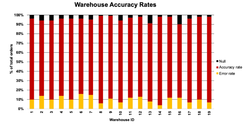
Using color strategically and sparingly is often the quickest and easiest change to improve your data communications. Today’s quick post is a cautionary tale about not using color strategically—both in quantity and color choice.

how does this graph make you feel? — storytelling with data

Sharpen your Clutter Detector

Sharpen your Clutter Detector

Data Visualization Events

Data Visualization Events