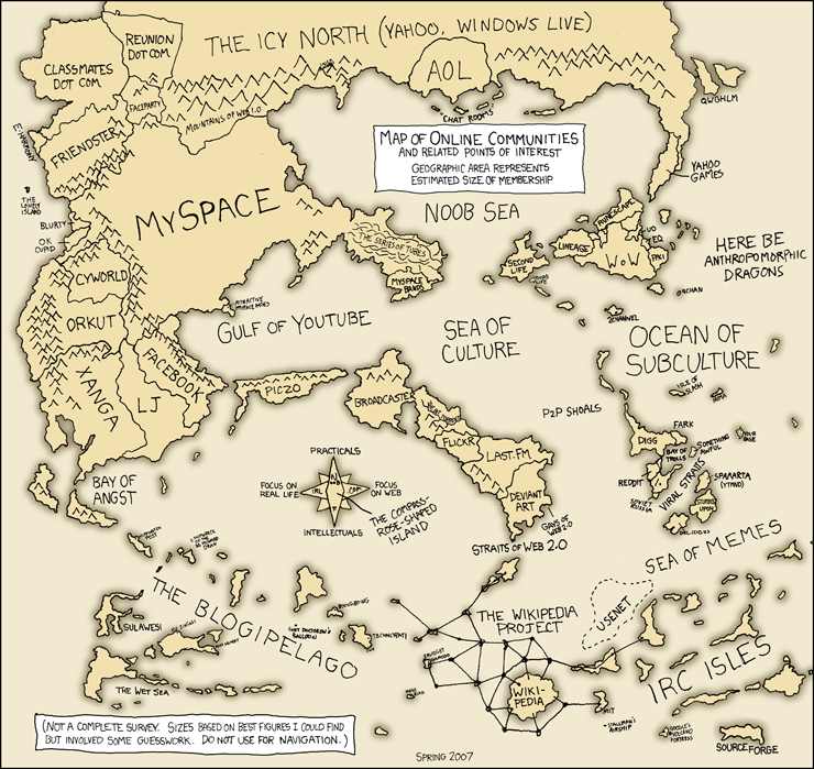
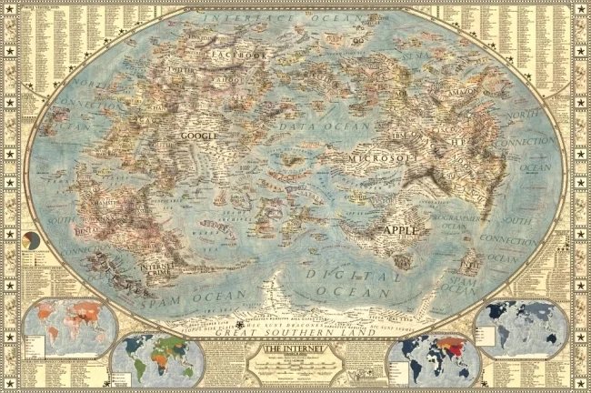
Map of Online Communities
Greetings from the Blogipeligo!
A fun infographic from xkcd.com that uses a map image to communicate the relative sizes of the different types of online communities. I was impressed that I at least recognized most of them, and actually participate in some of them.


