Map of Online Communities 2
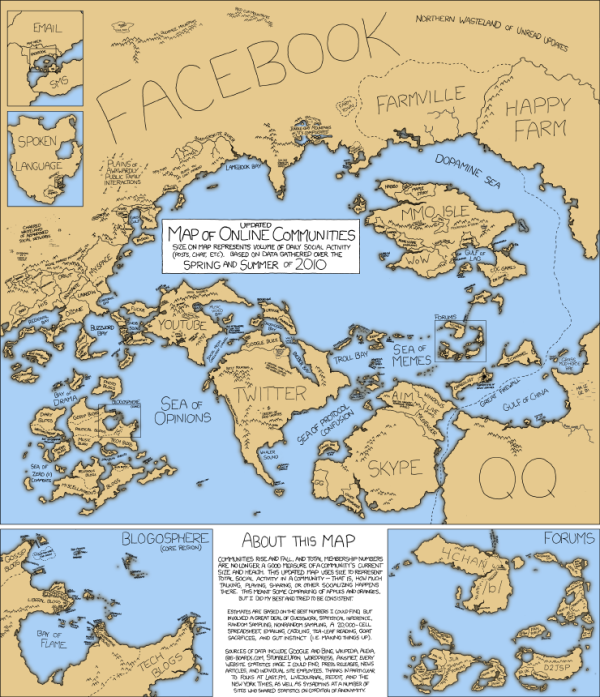
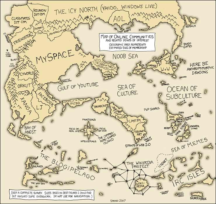
This is one of my favorites. xkcd has updated their Map of Online Communities for 2010! This is an update from the original 2007 Map of Online Communities, and has changed quite a bit.
Communities rise and fall, and total membership numbers are no longer a good measure of a community’s current size and health. This updated map uses sizes to represent total social activity in a community - that is, how much talking, playing, sharing or other socializing happens there. This meant some comparing of apples and oranges, but I did my best and tried to be consistent.
You can also view the LARGE version, or pre-order the poster.


