Tracking American Poverty - interactive infographic
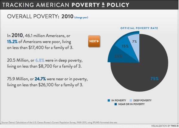
Tracking American Poverty & Policy is an interactive infographic visualization site that breaks down the data about…you guessed it…poverty in America.
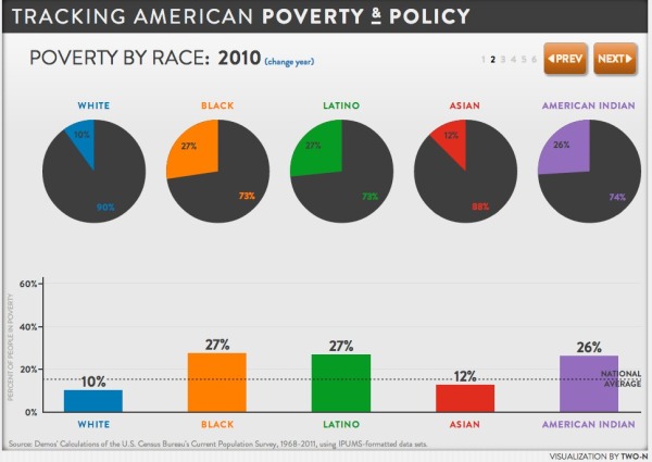
The site provides a sequence of interactive pages that start with the overall poverty numbers, and then break them down in more detail by race, gender, education, age and family type. In addition to the initial pie charts for the official poverty rate, the visualizations change to show details for Near Poverty, In Poverty and Deep Poverty numbers when you hover your pointer over each chart.
You also have the option on each page to change the year to see how the number have changed from 1967 - 2010.
Good visualization design by Two-N


