


Life Expectancy at Birth
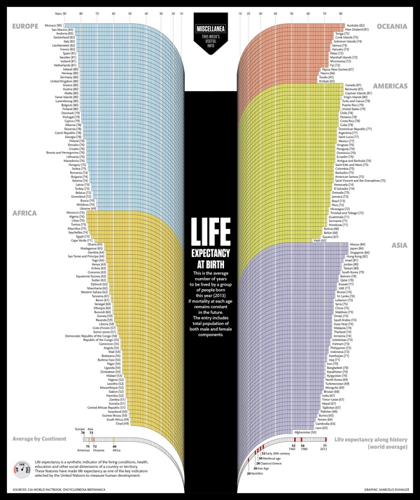
The Life Expectancy at Birth infographic by designer Marcelo Duhalde from Muscat, Oman is a fantastic data visualization of the current life expectancies by country if you were born 2013.
Average number of years to be lived by a group of people born last year (2013) if mortality at each age remains constant in the future. The entry includes total population of both male and female components.
From a design perspective, this infographic tells one story really well. The infographic focuses on communicating one set of data effectively (lifespan) without complicating the design with additional extraneous information. The overall design is very attractive, and grabs the audience’s attention with a big, central visual element. The curving bars are unusual, but have the benefit of condensing the early years so they take less space in the overall design.
At the macro level, it’s obvious there is a big difference between the various countries and continents. The readers are drawn in to compare the details of the different countries they are familiar with. Usually starting with where you live, and then looking to see which countries fare better or worse than your location. Of course the data represents a massive generalization of millions of people, but does tell a great story at that higher level.
The design looks like it’s perfectly sized to be printed as a poster, but I couldn’t find any mention of one. The sources could definitely be more specific than just listing the top level sites that data was gathered from, and the URL to the infographic landing page on Visualizing.org should have been included in the footer information.
Found on PolicyMic


