


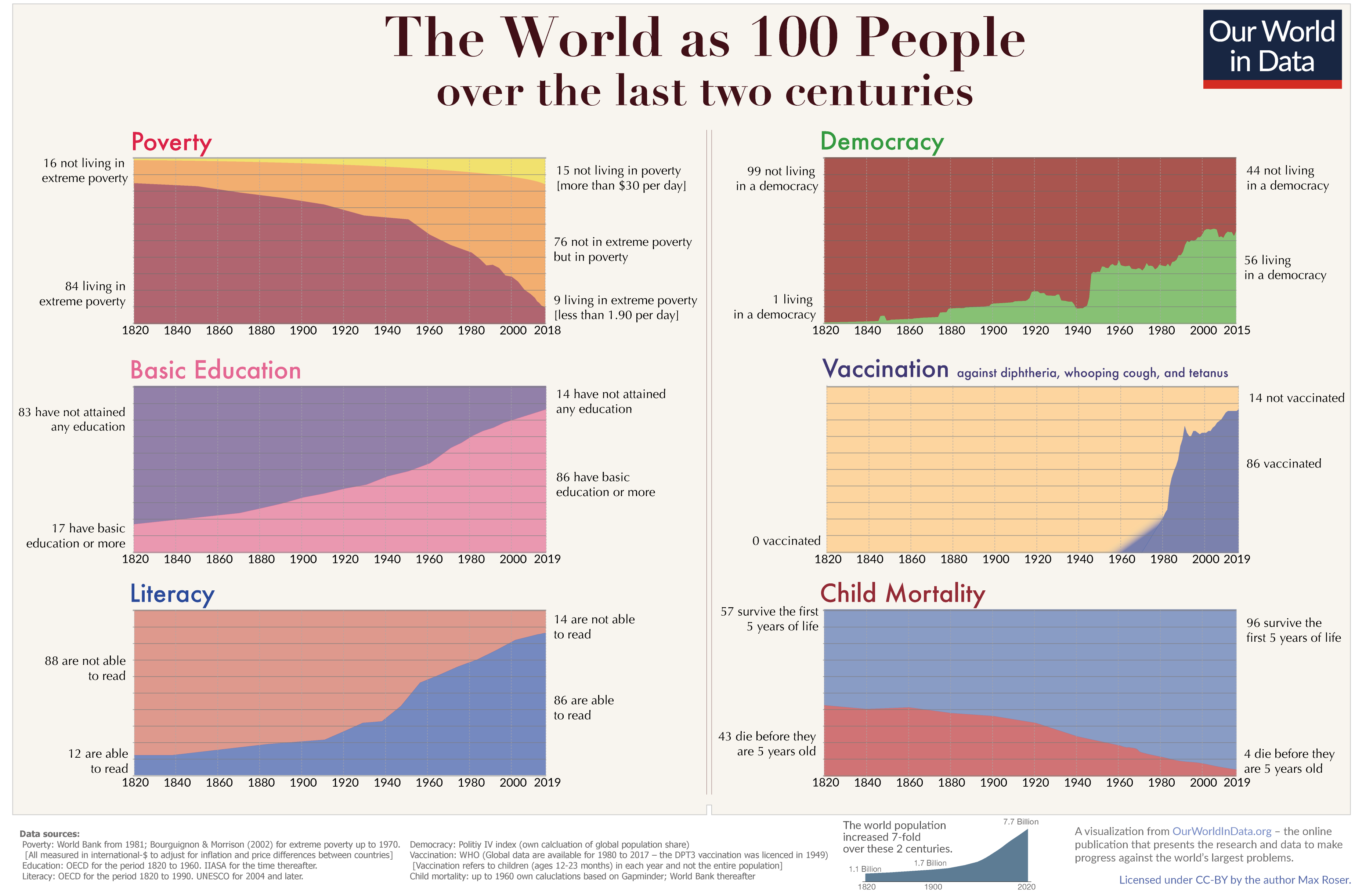
How The World is Getting Better in 6 Charts

The World as 100 People Over the Last Two Centuries is a good summary from Our World in Data, a website dedicated to capturing the story of human progress in the form of data visualizations, of their much longer article about the history of global living conditions and why it matters that we know it.
For our history to be a source of encouragement we have to know our history. The story that we tell ourselves about our history and our time matters. Because our hopes and efforts for building a better future are inextricably linked to our perception of the past it is important to understand and communicate the global development up to now. A positive lookout on the efforts of ourselves and our fellow humans is a vital condition to the fruitfulness of our endeavors. Knowing that we have come a long way in improving living conditions and the notion that our work is worthwhile is to us all what self-respect is to individuals. It is a necessary condition for self-improvement.
Freedom is impossible without faith in free people. And if we are not aware of our history and falsely believe the opposite of what is true we risk losing faith in each other.
here you can download the 200 year chart in high resolution to print it out.
Well designed charts can tell a very compelling story, and this one was recently shared by Bill Gates on his Twitter Feed and discussed during an interview on CNBC. It has also gained coverage from Forbes, Business Insider, Vox Media, and Marketwatch.
These data sets are shown with fairly simple 100% area charts, and are separate, interactive charts in the full article. The text labels on the left and right of each chart give the reader a clear comparison between life now and 200 years ago. I’m confused by all of the colors though. I would have kept a consistent color scheme for the good vs. bad portions, but the colors they chose don’t make sense to me.
I appreciate how this summary infographic was put together know that people would share it without the rest of the article. Data sources are cited, a Creative Commons license is included, and the URl to their website is easy to find.


