Great DataViz Design: Justice Scalia's Ideology
The Upshot at the New York Times consistently does a great job visualizing data. How Scalia Compared With Other Justices is a fantastic example of clean, effective storytelling with chart design!
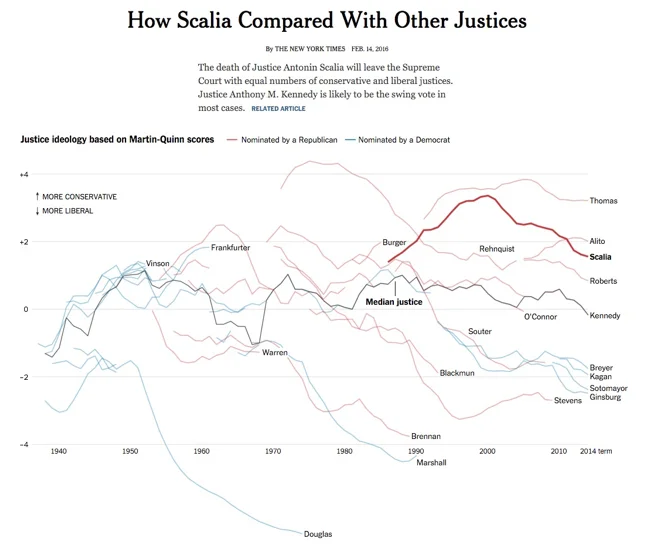
The death of Justice Antonin Scalia will leave the Supreme Court with equal numbers of conservative and liberal justices. Justice Anthony M. Kennedy is likely to be the swing vote in most cases.
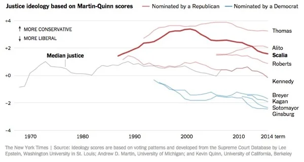
For social media, they published a simplified version that just shows the current Justices:
Why is this design so good? Here are my thoughts on why this chart design is great:
Minimal chart legend. The color key shows only 2 colors to designate the party of the nominating President. The names of all the Justices are built into the chart itself, which keeps that important information tied to the data in the reader's field of view. Default charts in MS Office would have created a different color for every Justice, and made this chart confusing and visually noisy.
Minimal axis labels. Notice the x-axis only shows a label for each decade. You don't need to know where 2004 is specifically. I think they could have minimized further to just the first and last years.
Use of opacity. Justice Scalia is the main story of the visual, so his line is heavier weight and bright color. This is a great use of preattentive attributes! All of the other Justices are shown is lighter colors for reference, and the main story stands out.
Minimal grid lines. There are a lot of lines on this chart, so only a few gridlines are included to keep the chart as simple as possible.
Minimal Text on the page. The chart is connected to a full article, but on this landing page the data visualization tells the story all by itself. The description text on the page is only two sentences long, leaving the visual as the visual centerpiece.