US Population Projections by Age Through 2060
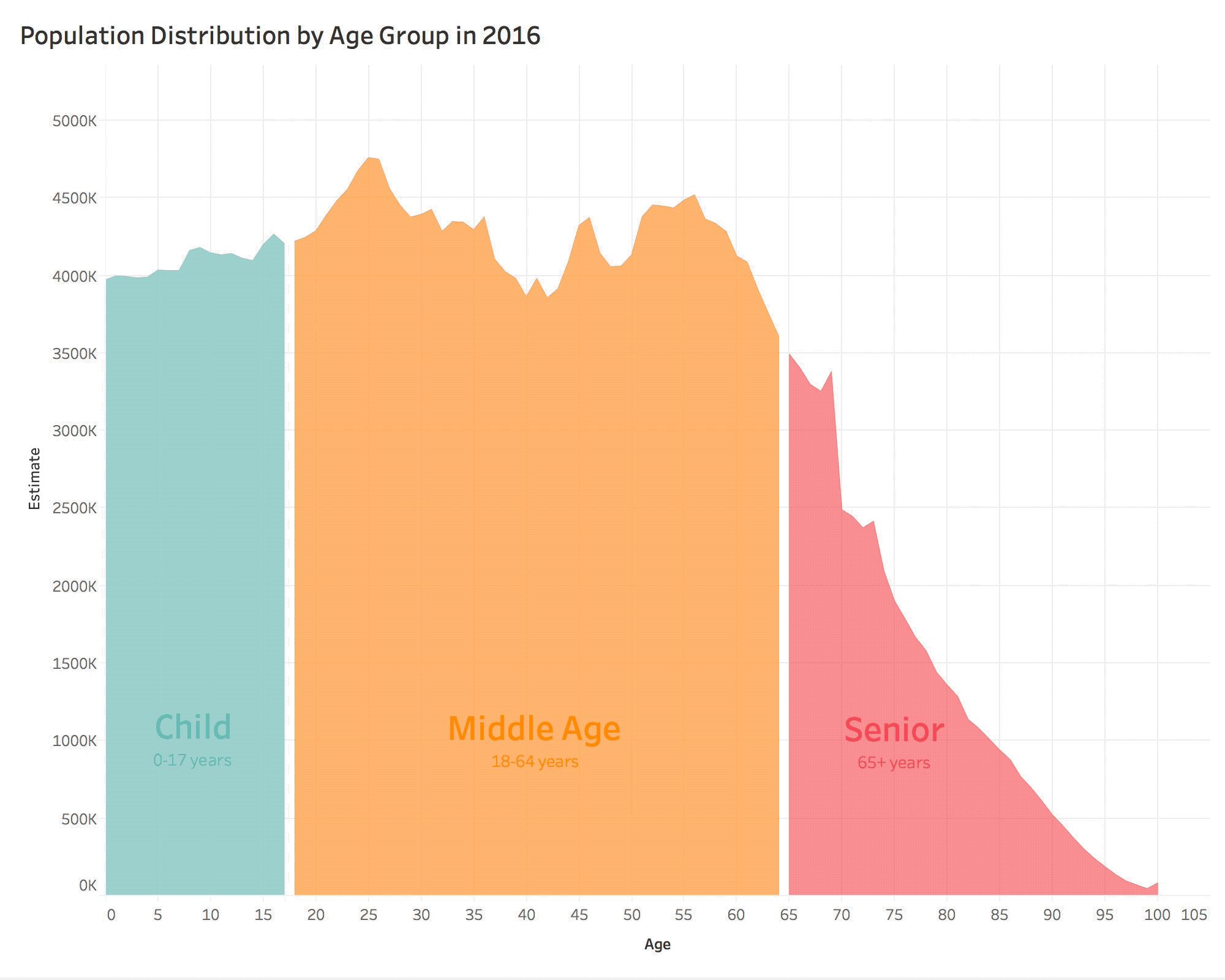
I really like this US Population Projections by Age Through 2060 posted on reddit by user mskm203. It was built in Tableau using U.S. Census Data projections. Each year is plotted, and then the sequence is recorded as a video and animated GIF file.
This was submitted as part of a Makeover Monday data visualization redesign challenge.
I would change the age group labels to white text for better readability.
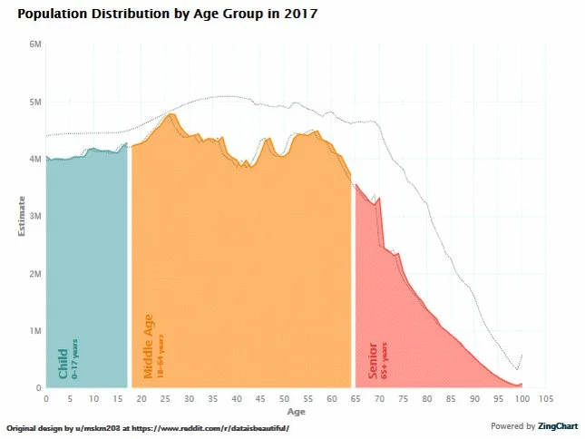
Tableau isn’t the only tool that can create visualization like this. As a challenge, ZingChart took this design as inspirtation and redesigned it using their javascript charting tools and made a few tweaks to the design. You can see that here:

I appreciate the design tweaks from ZingChart like the lines showing the start and end distributions. Fewer stops on the y-axis help reduce the gridlines clutter. Also, shortening the text in the y-axis labels using the scale of Millions. However, I don’t like turning the text labels for each age group 90°, that makes it much harder for readability.
Especially when viewed as a static image, instead of the animation, the lines for the start and end distributions are very helpful.