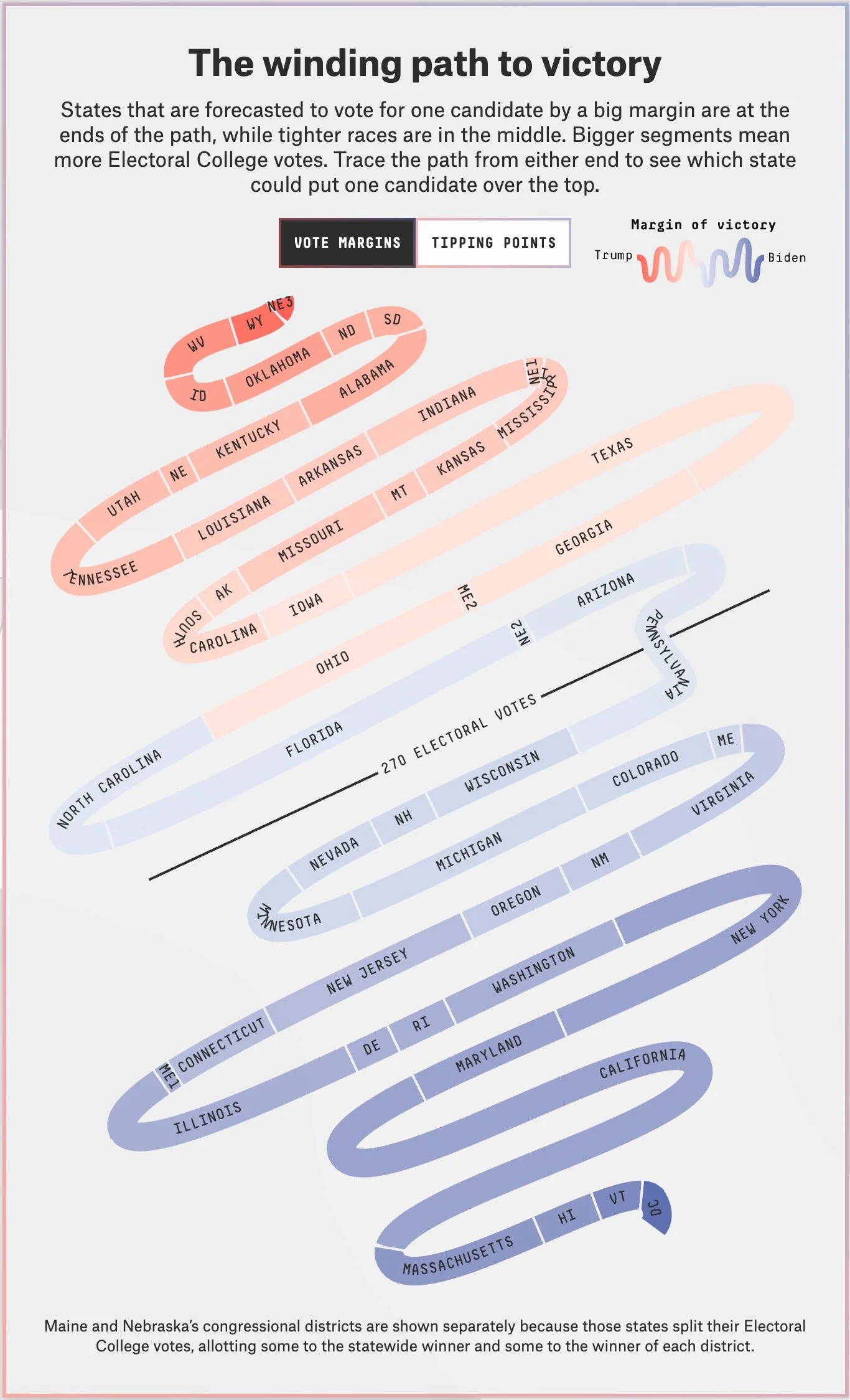
Meet the New "Snake Chart"

The team at FiveThirtyEight have created a new data visualization they are calling the “Snake Chart” to help show which U.S. states are key to the Presidential election, and how they are currently predicted to swing.
From FiveThirtyEight:
We call this the 🐍 snake 🐍 chart! This makes it easy to see why some states are hotly contested and others mostly get ignored.
States that are forecasted to vote for one candidate by a big margin are at the ends of the path, while tighter races are in the middle. Bigger segments mean more Electoral College votes. Trace the path from either end to see which state could put one candidate over the top.
So, there are a couple thing going on in this chart.
Proximity to the center line designating the 270 Electoral Votes threshold show which states are in the tightest races.
The length of each state on the snake represents how many Electoral Votes it has
The color of each state shows how entrenched they are for either party candidate