Climate in the United States

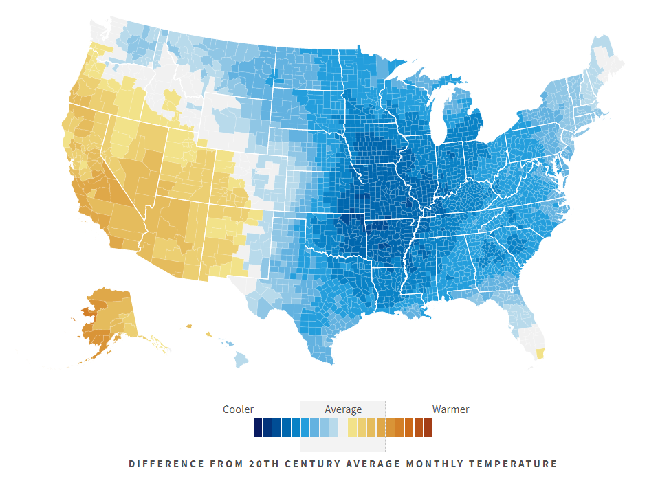
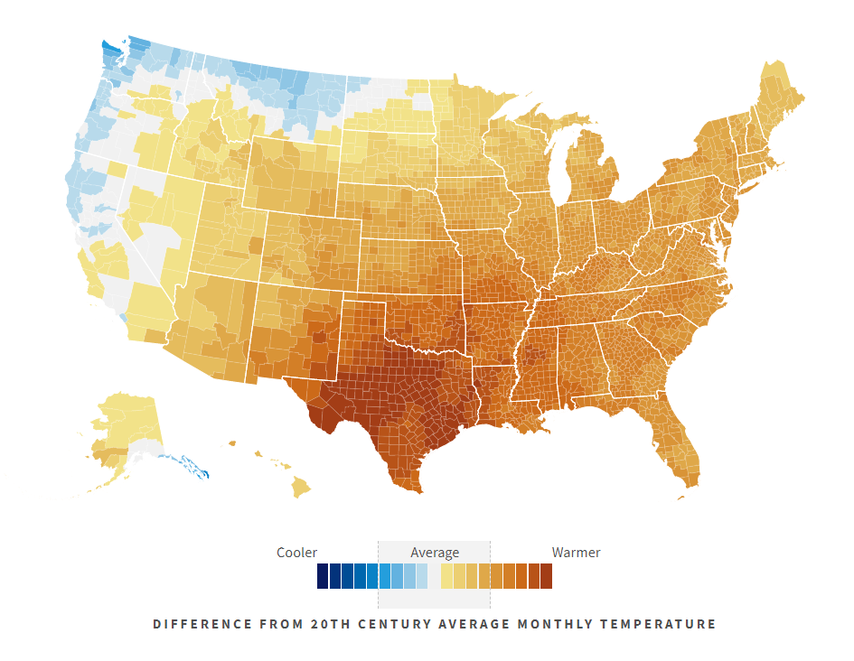
Climate in the United States in a new interactive dataviz tool to visualize temperature and precipitation differences from “average” by location, population, and demographics. The featured map above shows where in the US are temperatures hitting monthly extremes in December 2021, followed by 2010 and 2000 for comparison.
It’s being updated with new data all the time, but it’s not a real-time tool/ The most current data available is roughly 3-4 months ago.
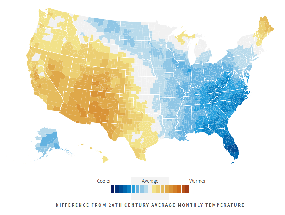
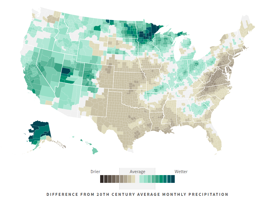
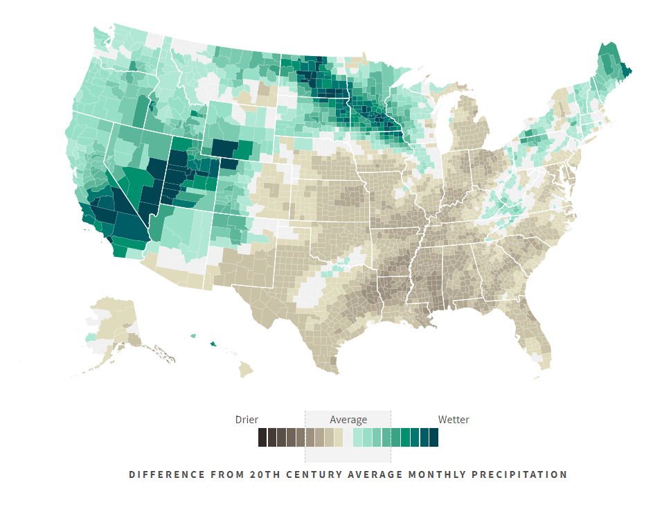
Below features the precipitation extremes for the US in December 2021, 2010, and 2000.

The nation has experienced a wide variety of extreme weather over the last 125 years. But what’s extreme in one locale is obviously not always extreme in another, and what seemed extreme decades ago might now be commonplace. So, for everyone who’s ever wondered, “Is this weather normal?” USAFacts created the Climate in the United States experience.
What can you do with this new tool? Use it to track monthly average temperatures on a local level. Check total precipitation where you live and around the country to see where it’s getting wetter or drier. Compare 20th-century averages against unexpected weather events for a fuller idea of what’s “normal.”
Visit USA FACTS to interact with the data fully and view the same data based off of population and demographics.