


Visualizing Ukraine's Trade
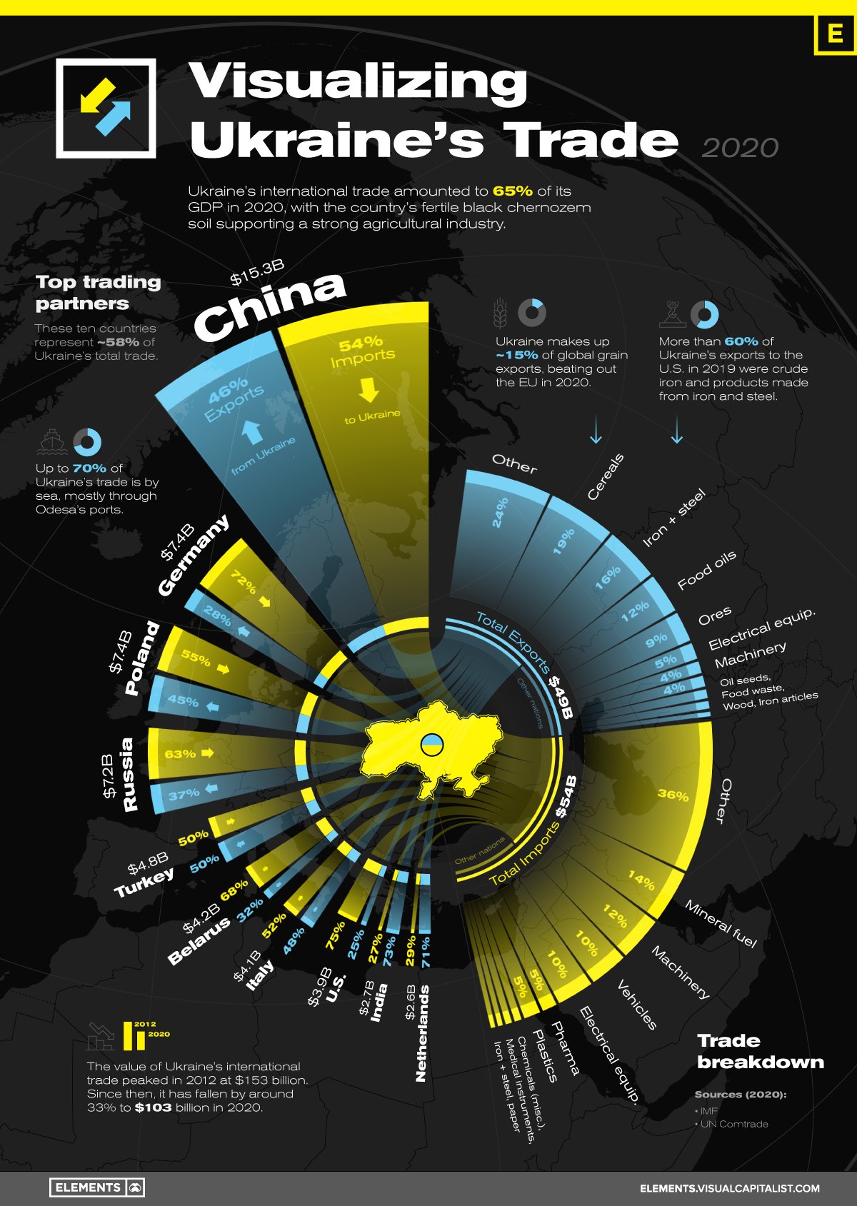
Russia’s invasion of Ukraine is rapidly reshaping both countries’ international relations and it’s especially timely for this Visualizing Ukraine's Trade infographic from Visual Capitalist to take a look into the Ukraine’s top trading partners and products. I really like this visualization, and it intrigues me because it combines a couple different visual formats into one. It takes a little effort to understand everything that’s going on here.
At its heart, this is a Chord Diagram, as displayed in the center circle. The top ten trading partner countries are arranged in descending order down the left side of the circle, and the top 10 products for import and export are arranged along the right side. Weighted lines show the amount of each type of product traded connected with the appropriate country.
The Blue/Yellow color scheme, pulled from the Ukraine flag, works very well to differentiate Imports vs. Exports. It also avoids the overused stoplight colors of Red/Green and the many issues with those colors.
Outside the circle, the visualization changes into a combination of a Nightingale Chart and the Chord Diagram lines are extended to create many Doughnut Chart segments. You can see how the trade numbers with China extend further out than any other country, which is supposed to represent the higher total trade value, and get smaller as you look down the countries. Each individual country adds up to 100% creating its own small doughnut chart segment visualizing the difference between imports and exports.
PROBLEM: One problem I see here, is the Nightingale visualization seems to be calculating the proportional radius distance based on the total trade value. You can see this as China is roughly twice the radius of Germany, because it’s twice the total trade value. This creates a False Visualization, since we see the area of these shapes to represent the values, not the radius. This is more difficult to calculate since we aren’t using simple rectangles here.
There’s a map in the background, that you might miss. Centered on Ukraine, which is highlighted in the center of the visualization, the rest of Europe, Africa and the Middle East can be seen as the background to the entire infographic.
Found on Daily Infographic

![US/China Trade Infographic [Making-of Video]](https://images.squarespace-cdn.com/content/v1/5bfc8dbab40b9d7dd9054f41/1552506405646-O1MW6JLEYAXCPKE1OHL2/us-chinatradecomparison-2.jpg)
